In this list, you will find a total of 100 InDesign Templates (including both free and paid options). We've carefully handpicked them and divided them into several categories. Feel free to jump to the section you find most interesting:
- Free Brand Guidelines Templates
- Modern Brand Guidelines Templates
- One Page Brand Guidelines Templates
- Creative Brand Guidelines Templates
- Minimal Brand Guidelines Templates
If you have no time to scroll? Find the styles you like more quickly by using this search bar:
Free Brand Guidelines Templates
1. Fresh and Basic Style Guide

This style guide is the one if you're looking for something uncomplicated and simplistic in its presentation. The structure is simple to comprehend, the typographic style is classic, and the color palette consists of four simple yet fresh and bright colors.
2. A Pop of Pink

This style guide features a unique structure, prominent visuals, and texts to bring attention to the content. Check out the massive pink block that serves as a symbol of the brand's color and the comprehensive style that speaks for itself.
3. Effervescent Style
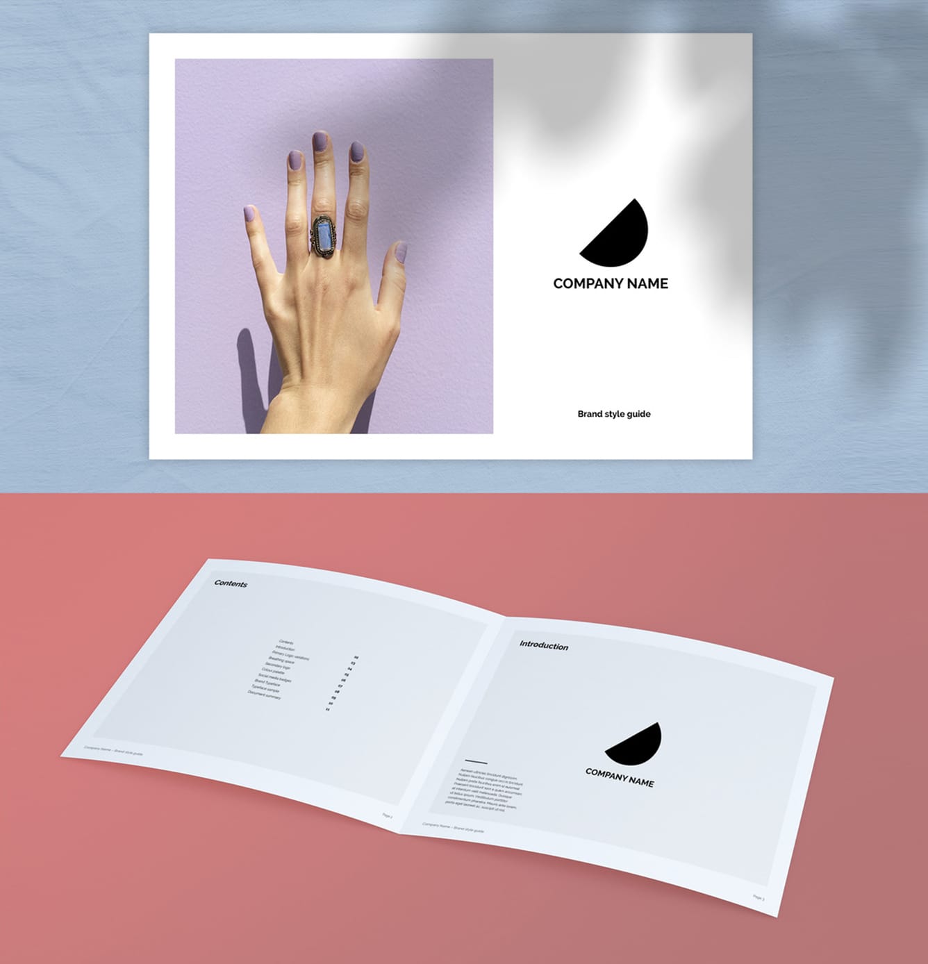
The perfect blend of outstanding taste and cutting-edge, modern design! That's exactly what this layout exudes! If you want to present your brand in the most effervescent way possible, use this photo-dominated layout with impeccable style.
4. The Modern Elegant Layout

Modern and elegant. These are just some things you can expect from this stunning book layout! Versatile and tasteful in its choice of color. The overall design is exquisite, with a professional look and an eye-catching layout.
5. The Detailed Minimalist

Minimalist, delicate, and detailed. Clearly laid out and easy to modify. This extensive and precise style guide allows you to display detailed and outlined branding. You'll be able to present your work in an organized and logical manner.
Modern Brand Guidelines Templates
6. Simply Chic

Effortless, stylish, and sophisticated all at once. The clean, uncluttered layout of this guidelines brochure will catch your eye. With this primary color template, you can begin attracting your target audience right now.
7. White and Blue Layout

The layout features landscape orientation, bold typography, and a vivid blue color palette. The layout provides a clean structure with distinctive line elements and excellent text arrangement for each page.
8. White and Apricot Combo

Catch attention with this fantastic template with a striking look, thanks to the white and apricot color combination! In addition, it has a wide range of practical, informative, and compelling elements—a terrific method to show off your brand.
9. The Structured Layout

It has never been simpler to show your work in a compelling and enticing style. Text and images are set out by a blue-violet and soft green blend on a white backdrop with solid headers.
10. The User-Friendly

This design has a user-friendly layout that sets it apart from the others. With a simplistic design and a simple color palette of black, blue, orange, and gray, you get just everything you need.
11. The Green Elegance

This layout features a darker green color scheme than most traditional portfolios. The text and photos are clearly defined using a combination of dark green and white and powerful headers. Take your branding to a new level by using this template.
12. Pastel-Themed Layout

If you're seeking a style that will let you show off your brand straightforwardly and uncomplicated, this template is all you'll ever need. The lovely pastel color is what sets this design out. It is proof that "pastel" doesn't always mean "washed out."
13. Black and Green Accents

In addition to its clean layout and elegant color scheme, this template is amazing. For the most part, it has a superb construction that would please any perfectionist. Unique green and black accents produce a striking visual effect that is sure to pique the interest of any reader.
14. Bold and Beautiful

The headlines are large and crisp, and the typography is clear. In this design, plain white, black, and green backgrounds frame your text. A brand-consistent basic palette and large, strong headings make scrolling through the guide fast and straightforward.
15. Simply Red

This red and white layout will help you present your work in the best light possible. Red is powerful and eye-catching. This template features a great layout, a straightforward design, and proper use of white space.
{{banner-component}}
16. Red Black White Triple Combo

With entire pages of red, black, and white boldness, this template is simple, clean, and stunning. You may sort various contents nicely, the headings are strong and clear, and the typographic design is simple to understand.
17. A Touch of Yellow

The clean structure and elegant white and yellow color scheme make this layout stand out. The practical arrangement and an overall comprehensive structure of this template will win you over, in addition to the warm color palette.
18. The Green Minimalist

This template exudes elegance and simplicity. The information takes center stage, and the text arrangement is meticulous and thorough. The blue-green accent is light and fresh. At the same time, it is minimalist and appealing.
19. Beige Boldness

With beige as the dominating hue, the design is minimalist, clean, and stunning. This layout is well-organized and appealing to the eye. Furthermore, the beige's vibrancy will make your ideas and content stand out.
20. Gray with Coral Accents

With dominating grey accents, don't be scared to show off your brand with this basic, clean, and stunning design. Over everything, simplicity, and professionalism! It isn't easy to find such an appealing and professional design among all the many templates.
21. The Straightforward Layout

Looking for a layout with a simple style that's easy to read, follow, and comprehend? If yes, this is the template for you. Above all, it is well-organized, with a splash of orange to visually emphasize your work.
22. The Yellow Landscape

This template's landscape orientation is only one of its many features. The outstanding layout is jam-packed with valuable and eye-catching components and yellow accents. Each page lets you express your creative process from the first concept to the final implementation.
23. The Pale Peach Layout

This layout's distinctive design incorporates white and pale peach accents for a gorgeous look. Its customizable parts are both practical and effective. Light pastel peaches are often associated with pleasantness. To put it another way, it's a fantastic approach to displaying your brand.
24. Out Of The Blue

Keep it cool with this fantastic layout with white dominance and blue accents. You will keep your readers captivated with its simple design, professional look, and compelling presentation.
25. The Blue Dominance

This 36-page sleek and organized brand guideline layout is ideal for entrepreneurs, bloggers, businesses, etc. The wonderfully crafted template will boost your brand's visual identity. Blue accents are an easy choice for presenting your brand.
26. White and Orange Combo

If you want to play it safe, a template like this is the best option! It is basic and well-structured, with white and orange as the utilized colors. The orange adds a dose of optimism and a fun and relaxing vibe. Overall, this is a timeless layout.
27. Pretty As A Peach

A soft peach background makes way for these louder, brown accents. This color pair does well because it maintains a balance between the two tones. Light peach adds a little youth, and the brown accents offer some warmth and natural comfort. This template will impress you with its simple, elegant yet detailed design.
28. Beautiful Earth-Toned Design

Variations of brown are seen in this template. The combination of soft tones adds an important level of contrast and seriousness. The earth colors tied the layout together, making it elegant and intriguing. The typography and design allow you to quickly put together a timeline and content you want to put out.
29. The Elite Portfolio

This layout screams high-class and luxury! This exquisitely designed template comes with a mix of soft green, black and white colors, making it a perfect choice for modern branding. It comes with 35 pages, clearly labeled layers, an easily editable display, etc.
30. The Unique Yellow Landscape

Attractive yellow accents paired with plain white pages create this distinctive visual landscape that will captivate every reader's attention. This design is unique and unconventional. The yellow and black combination creates a sense of energy and liveliness.
31. White and Blue Elegance

Elegant hues and a well-structured design! The color choices fit perfectly, like blue jeans and a white shirt. This Envato template is the fantastic style you'll need to present your photos, infographics, and text in a clever and attractive manner.
32. Black and Yellow Layout

This template is ideal for creative businesses with its minimal and professional design. Black and yellow are two colors that go really nicely together. It creates a feeling that's modern yet approachable.
33. The Bold Red Layout

This layout is fashionable and exquisite, and it can be mixed and matched conveniently. It has a minimal style with plenty of white space, bright red, and powerful fonts. It is jam-packed with fantastic page layouts suitable for fashion, photography, art, and businesses.
One-page Brand Guidelines Templates
34. Light and Dark Brand Guideline

The typography, examples, icons, etc., are effectively categorized in each section in this style guide template. The dark options are refreshing to use for the texts to pop up. It is also available in a light background.
35. Minimal and Muted

With this minimalist and professional one-page template, you may focus on the essentials while eliminating bloated and complicated information. Not to mention the pleasant 'muted' color palette is eye-candy.
36. Blue and Red Brand Layout

With the versatility of round and square forms to promote brand evolution, this poster-sized infographic layout with blue and red color options generates professional deliverables, presenting and promoting the brand in an ordered manner.
{{banner-component}}
37. The Green Light

This brand guide is designed to be printed out and hung up to serve as a handy poster for everyone to consult. It is straightforward, from the custom icons and font to the muted green options.
38. Layout with Tan Accent

This unique brand guideline is ideal for brands with a very minimalistic approach to design and branding. This layout can quickly outline your brand fonts, color palettes, and other high-level brand needs. The bold brand identity section and tan accent are eye-catching.
39. The Orange Accents

In this brand guideline, you can show exactly how to use your logo in each section. The orange accents make it practical to convey content. The design is available in two layout sizes and two color palettes.
40. Fair and Square

This brand guideline includes four approved variants of the official colors to eliminate the need for guessing when applying tints and colors in the future. The square shapes throughout are consistent, and the six background color options are versatile and playful.
41. The Basic Corporate
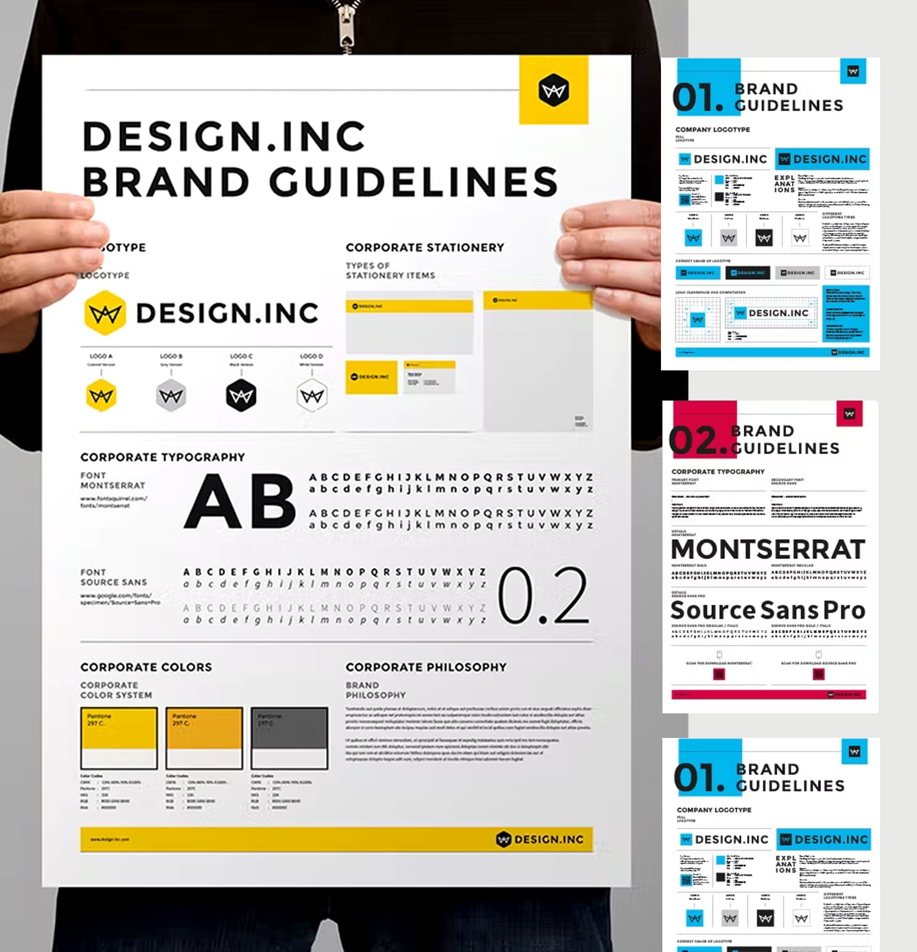
Plain white is safe and effective in this brand guideline template because the colors and text can shine on a background. Look at how vibrant the colors and text are on the page. You may use yellow, blue, red, and gray as accent colors.
42. The Red Font
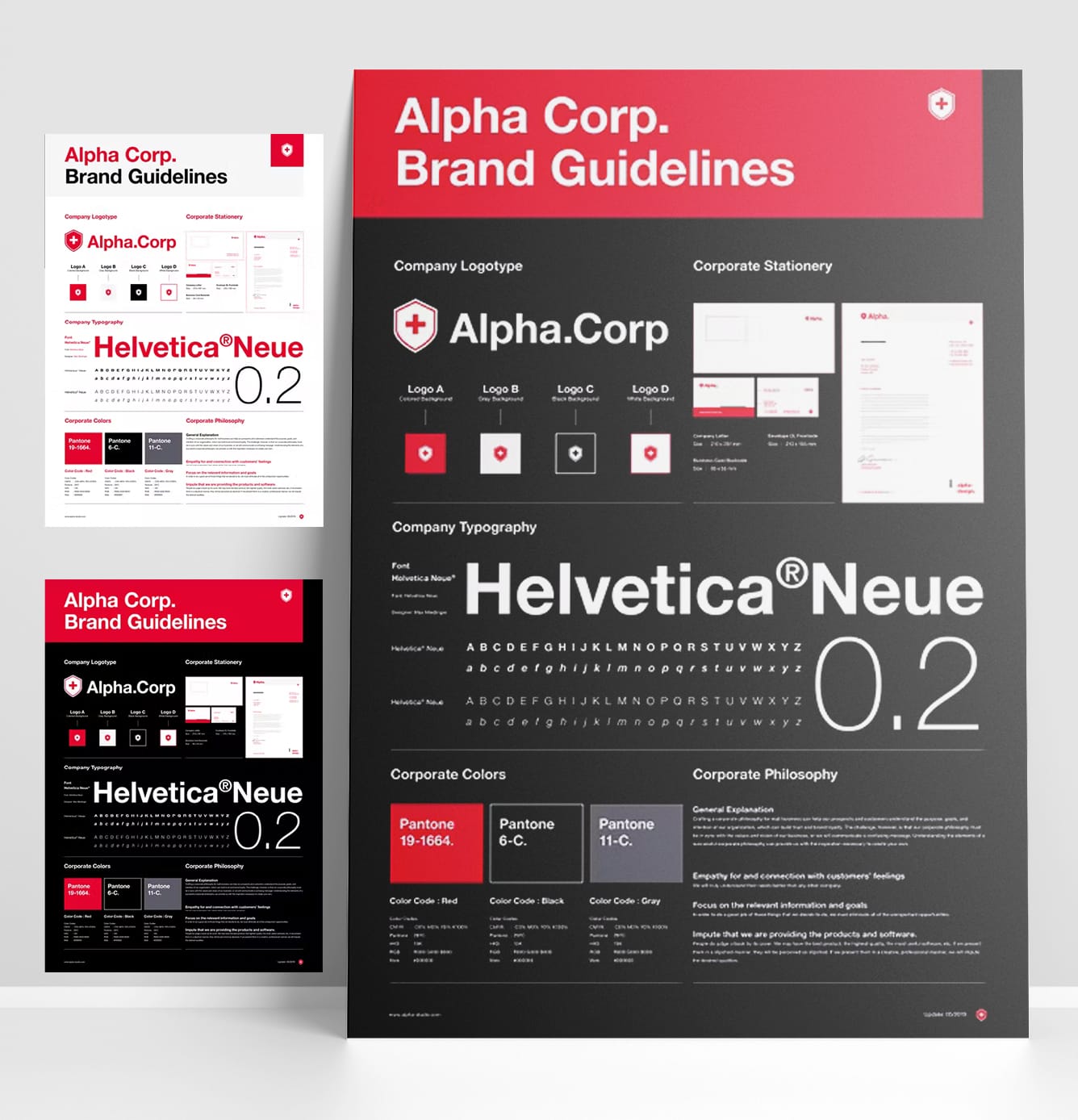
One of the easiest ways to bring attention to values or keywords is to highlight them, like in this brand guideline template. As you can see, the designers used a red font to make a few key phrases jump off the page.
Creative Brand Guidelines Templates
43. Pink Accents in Black and White

Light pink accents and easy-to-read fonts in white and black backgrounds give this template a clean, crisp look. The front cover features an engaging tagline, and the categories are in a large font on each page.
44. Red Accents on Black and White

This brand guideline template has a versatile design that includes black and red colors in landscape form. Fonts are in creative black and red too. This layout will help keep your look and feel consistent from the initial page right through the last.
45. Simply Creative

This brand guideline template will help you develop a consistent brand identity. It has a simple yet creative design and a color palette with both bright and subtle tones of red and green mist.
46. The Classic Professional

This brand style guide template uses space and landscape exceptionally well. You can quickly move through the information because nothing feels really bunched up. Each color represents the category and content professionally.
47. The Stylish Orange

This brand guidelines template is beautifully designed and very easy to use. It includes the essential elements of a stylish layout, and the orange accents add beauty to the overall look.
48. Black and Pink Guideline Brochure
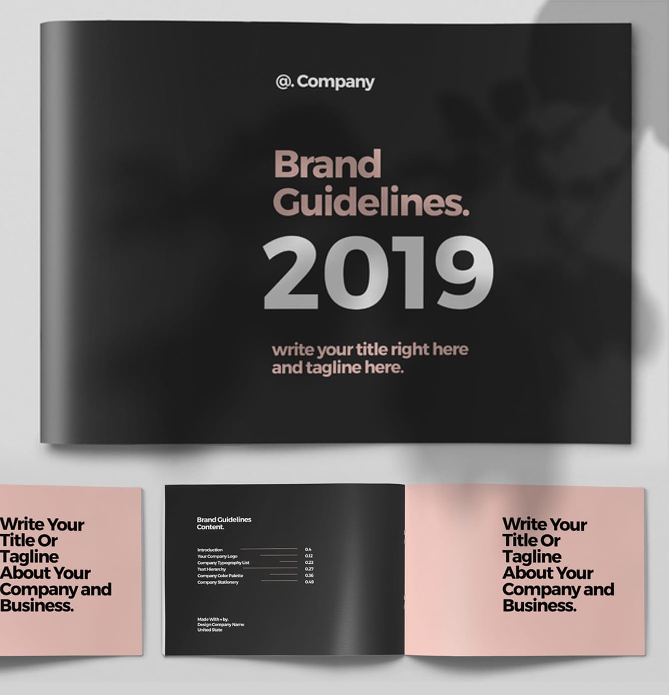
The black and pink layout and the large font are bold, loud, and eye-catching. It sets the tone for your communications, helps you convey your message with consistency and professionalism, and ensures that every customer touchpoint is an accurate reflection of your brand.
49. The Artsy Layout

Use this guideline template to create brand-compliant visual assets that work together to create a cohesive design. The patterns on each page are consistent, and the muted color combination is pleasant to the eye.
50. The Fun Illustrated Layout

Over the past few years, there has been an enormous increase in brands using fun and colored illustrations. The official illustrations in this brand guidelines template are a fantastic way to set your company apart from the competition.
51. Serious and Subtle

This brand guideline uses a coffee color that sets the mood, attracts attention, and can even influence emotion. The semi-retro design and minimal content on each page are unique and appealing.
52. Black and Red Boldness

Using colors to help readers move from section to section is a classic design hack. With bold black and red page and large fonts, it breaks down the somewhat lengthy guide into manageable chunks of information.
53. Dark and Creative

This brand guidelines template's dark and beautiful color palette makes it ideal for technology, startup, or corporate brand. Creative and professional.
54. The Blue-Green Wave

The wave abstract layout design in this template features a semi-futuristic conceptual backdrop. Its black and blue-green color accents are fresh, fun, consistent, and effective.
55. Earth Tones Brand Guideline

This brand guidelines layout has a distinctive earth-colored layout perfect for your brand project and wild ideas. The presentation slides were designed with imagination to give your customers the best impression possible.
56. Uniquely Creative

Each page in this template is unique yet coherent throughout the end and designed with creativity in mind. It includes design elements needed to communicate a consistent look, feel, and behavior for your brand.
57. Fresh and Professional

The color green used simultaneously with red in this template gives off a subtle, mature vibe. Partnered with light pink and minimal content on each page, it completes the overall look and feel of being fresh and professional.
58. Feminine and Sophisticated

The pink accents in this brand guide template give off a feminine and sophisticated look. The layout is straightforward and calm in landscape form, emphasizing the brands' content.
59. Minimal and Creative

Every page in this brand guidelines template is styled well, without using too many colors or forms. The design is modifiable, and the shaded blue-green is pleasant to the eye.
{{banner-component}}
60. As Green As Grass

These bold shades of green give a soothing effect instead of bombarding the eyes with colors. The design is relaxing, cohesive, straightforward, and very effective.
61. The Black Elegance

Black is regarded for its very functional aesthetic, making it an excellent background for many brand guidelines templates. The colors and text really pop on the dark background in this layout, especially the green accent. Minimal and elegant.
62. The Colorful Layout
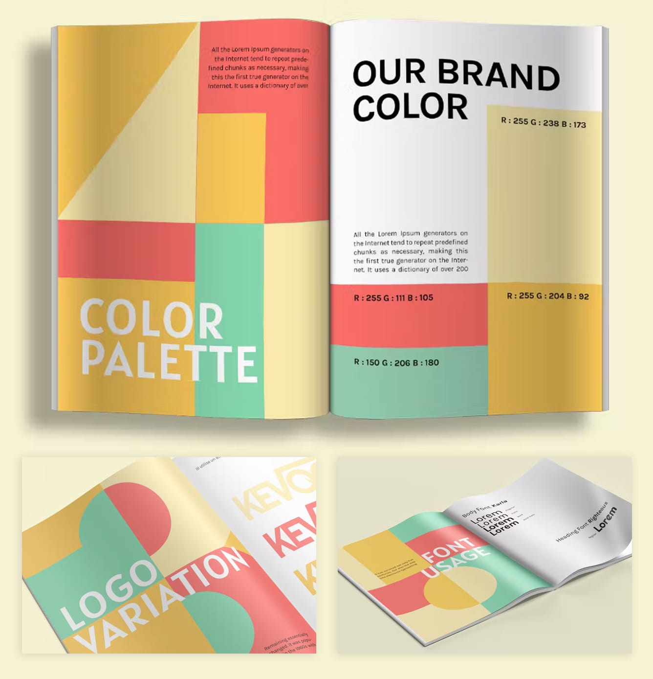
Using colors to help readers move from section to section is a classic design hack. With playful and colorful shapes, each turn of the page awaits fresh and appealing content.
63. The Horizontal Mint Layout

This brand guideline incorporates a unique horizontal design. The white and mint color combination exudes a melancholic vibe that is very chill and pleasant to the eye.
64. The Pretty Violet

This template has a contemporary, creative, sleek design and a pretty violet color palette. This one is best for design and marketing firms.
65. The Modern Creative

This template will come in handy if you're working on a brand handbook for a startup or a modern agency. It has a creative and contemporary style that will help you present your business professionally.
66. The Green Divide

The bold use of green page dividers and logos on each page makes your brand unforgettable. This layout is definitely set up for success with good placement of company logos, typography, icons, and more.
67. The Typographic-Art

This template exemplifies strong brand standards. Each page employs prominent typography to convey crucial information to readers. Everything is consistent, from the brand colors to the text and even the page headings—the greater the size, the better.
68. The Original Orange

Orange is the way to go! A print-ready horizontal brand book with a minimalistic, creative design. This template is simple to edit and publish. You can also change colors and texts instantly using the Color Swatch feature.
69. Luxurious Brand Style Layout

The colors black and green work well together. This template is perfect for you if you're working on a style guide for a luxury or high-end brand. It has a beautiful design that you can use to create a professional-looking brand style guide.
70. Less Is More

Your brand book guidelines will appear professional with this modern and original layout and powerful typography. It is for designers who are working on a corporate brochure or projects. Simply elegant!
71. A Breath of Fresh Air

This template guides a fresh approach to images that is both unique and customizable. The use of bright, colorful graphics and illustrations in conjunction with headlines helps to convey a feeling of creativity and professionalism.
72. Blue Font Accents

This creative template is simple, to the point, and has a techy vibe. Its modern design is based on blue fonts with a color palette of white and blue. The text blocks are clear and concise, providing an excellent framework for your brand guidelines.
Minimal Brand Guidelines Templates
73. On The Dot Layout

This template is simple and beautiful - ideal for anyone seeking to put together an excellent brand guideline. It has many great features, including the distinctive dot/period pattern, which you must fully appreciate.
74. The Warm Brown Template

This design is highly worth looking at if you want a simple yet eye-catching brand manual. This design achieves the right blend between contemporary and professional for creative businesses. Plus, the warm brown is pleasant to the eye.
75. The Landscape Lookbook

The landscape lookbook in this brand guidelines template has a professional, ultra-modern, and distinctive style, and each slide is produced with love and attention to detail.
76. Clean and Sophisticated

White space may make a big difference. You don't need a lot of details to get the story across: no matter what the company is, basic and clean designs are apparent winners. This brand guidelines template is clean, beautiful, and sophisticated.
77. Patted and Polished

The majority of professional brand guidelines have extremely basic designs - specifically to focus more on the contents therein. This template has a manly vibe and is an excellent example of a straightforward layout that draws attention to your content.
78. Minimal and Modern

This brand guidelines template is minimal, modern, and with a graphic concept. The template includes pops of colors on some pages. Perfect for any brand guideline that you may need.
79. Colorful and Professional
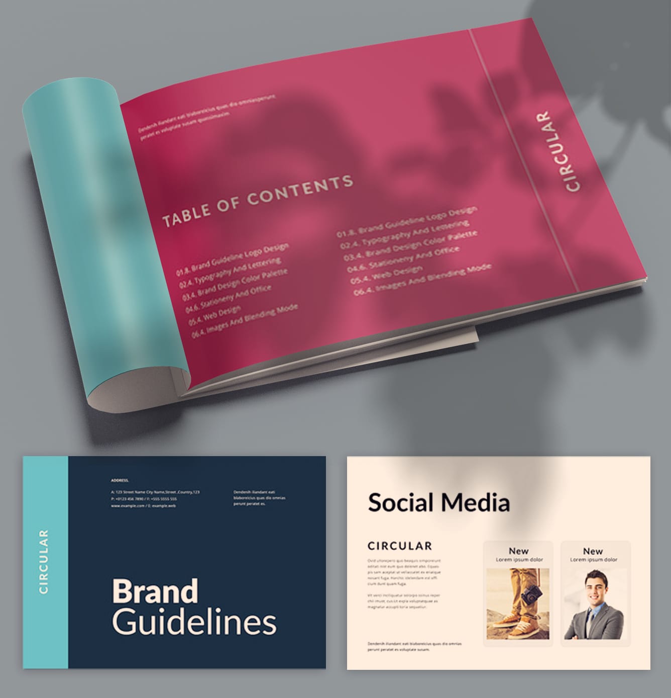
Thanks to an adaptable typographic approach and diverse color palette choices, this brand guidelines layout functions well in every business. Though minimal, it is colorful yet professional.
80. Warm-Toned Template

This brand guideline uses a mood board and warm tones to help visualize the feeling that you want your content to have. Each page incorporates minimal images and texts - a great way to help flesh out your visual brand.
81. The White and Green Combo

This brand guidelines template is simple, clean, and minimal. It's meant to capture the essence of your company's key messaging while keeping things uncluttered. The color palette is white and green, keeping it fresh and pleasant.
82. The Feminist

This brand standard is versatile enough to work across various industries. The design is straightforward, contemporary, and minimalistic, yet the watercolor accents give it a feminine, natural, and clean charm.
{{banner-component}}
83. The Black and White Classic

A basic color palette featuring just primary colors, black and white, gives the brand strong recognition. A sequence of contents and a primary divider give the brand a unique presence.
84. Warm Tones in Landscape Layout

The landscape style of this brand guidelines template makes them simpler to read and gives them a magazine-like vibe. The color scheme is soft and beautiful.
85. The Blue Minimalist

In every manner, this brand guidelines template exudes professionalism. It has a clean and modern style that showcases your brand with properly balanced formatting. The template includes 20 customizable page layouts and a warm blue hue.
86. Plain and Simple

Here we have an attention-grabbing layout that provides quick modification, allowing you to spend more time planning the contents of the brand guideline rather than modifying it. This minimalistic yet stunning template is deserving of a spot on your shortlist.
87. The Neutrals
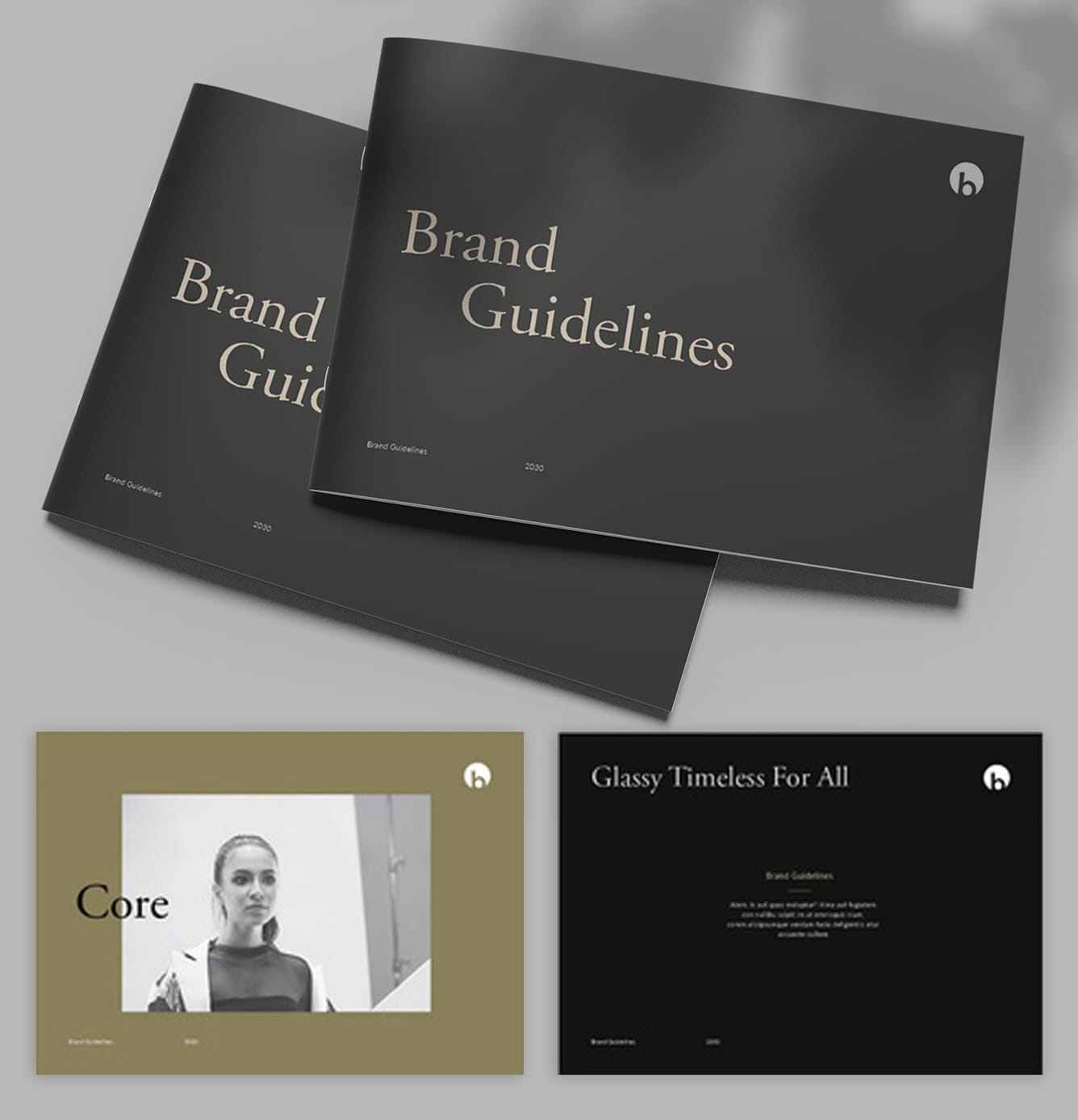
This template has a minimal design that shows a bit of earth feeling and offers a few neutral color options to choose from. The logo is simplistically designed and has a strong presence at the top of every page.
88. Keep It Classy

This brand guide template uses a branded cursive font in each page header to set a creative and playful tone. The text arrangement is classy and minimal, along with the white background and muted fonts.
89. White and Blue Combo

This brand guidelines' minimal and professional style makes it easy to create an excellent guide for your company or brand. The color palette is white and blue accents, which gives you the option of customizing colors on your title page. It contains all of the comprehensive sections you will need.
90. Clean and Simple

This brand guidelines template is designed to help you build your brand identity quickly and efficiently. It allows for easy navigation and quick access to all the information you need about your company. Clean, simple, and elegant.
91. Keep It Simple

This brand guide template starts with a black cover page that's intriguing but minimal. The rest of the white pages are coherent. Unique and straight to the point.
92. White and Brown Combo

Keep everything within reach with this brand guidelines template that is minimal and easy to navigate. The background is broken up by a clear and simple font, keeping your brand professional, while the brown and white color palettes are easy on the eyes.
93. The Basic Minimalist

This brand guidelines template is minimal and visually appealing. The images on every page tell a story, while the simple text gives you space to explain the finer details.
94. The Clean Aesthetic

This brand guideline specifies exactly what patterns and aesthetics you want to be associated with your brand. Making those minimal and arranged layouts will help you present a consistent brand.
95. White With Blue Accents

This brand guidelines template is simple and modern. With a simple white color scheme featuring blue accents, it's easy to stay focused on your content and create the best possible brand experience for your users.
96. The Serious Type

With a stunning title page like this template, you can set the tone of your brand right away. This brand guideline opts for a solid all-text style that seems profound and professional.
97. Chic and Minimal
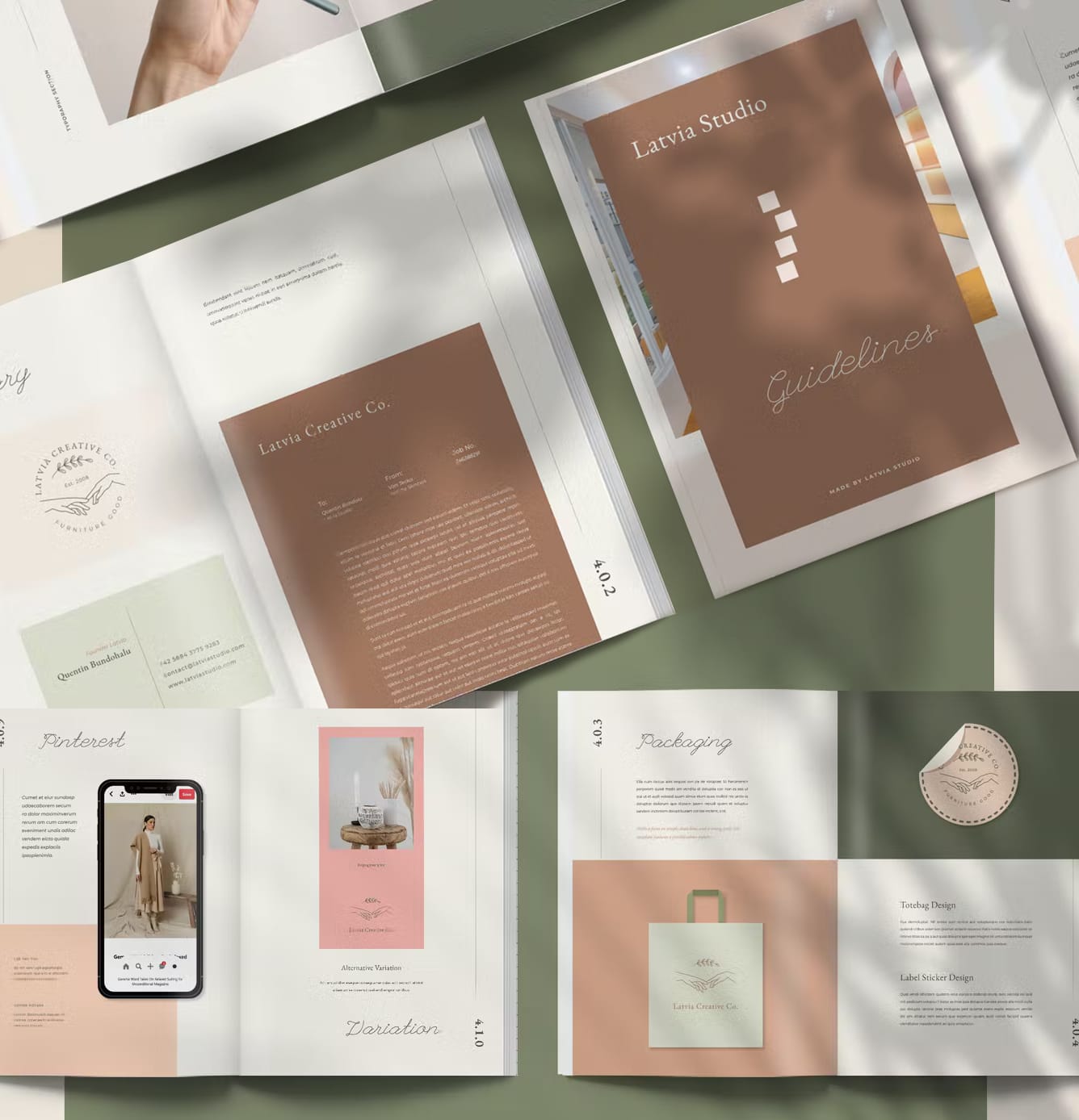
With this easy-to-use brand guidelines template, you can take your branding to the next level. It is carefully created with the end-user in mind. Simply add your logo and photos to display your brand/studio professionally.
98. White and Orange Boldness

This brand guidelines template has a well-designed layout that helps your company's visual appeal. It emphasizes clean, straightforward lines and a strong grid. Its beautiful design and rich orange color palette are ideal for any brand.
99. The Timeless Template

If you are looking for simple and timeless brand guidelines, you should get this template. It has a clean and distinctive design perfect for a lifestyle or fashion company. From picture gallery to iconography, everything is included.
100. The Stylists Dream

If you're searching for a brand guidelines template that sticks out from the crowd, this is for you. It has a unique design, chic and minimal, and can be customized entirely in Adobe InDesign. Stylists will love this template!
Conclusion
Well, you've arrived at the end of our super long list. We did our best to diversify our list in terms of colours, shapes, and styles so that no matter the business you're in, you can find something that will suit your new brand.
We hope you've found the perfect brand guidelines template. And thank you for taking the time to read this, by the way.
If you are looking into creating another type of InDesign document - make sure you head to our InDesign templates page.
All the best,
Stefano


