Using any of these architecture portfolio templates, you can present your story, past projects, processes, and architectural skills in a captivating way. After that, don't forget to pair your portfolio with one of our top 100 InDesign resume templates.
No time to scroll? Use this search bar to find the styles you prefer:
Professional Architecture Portfolio Templates
1. The Grey Palette

A monochromatic paradise! In addition to the gray color palette, there is a practical layout, a clever picture placement, and an overall structure that will keep the reader engaged.
2. Simplicity over Everything

Sometimes less is more and this architecture portfolio template is here to prove that. The white space between the elements is used smartly and allows the accent to be put on the content. A portfolio should reflect skill and experience, to that end, this well-balanced template is perfect for any professional.
3. Catalog Layout with Grey and Gold Accents

This template is exceptional because of its neat organization and classic combination of colors. Above all, its flawless structure will satisfy every perfectionist's needs.
4. Black and White Portfolio Layout

Put your work in the best light with the help of this black and white architecture portfolio template. It has an effective layout, a simple design, and powerfully used white space.
5. The Neutral Prowess
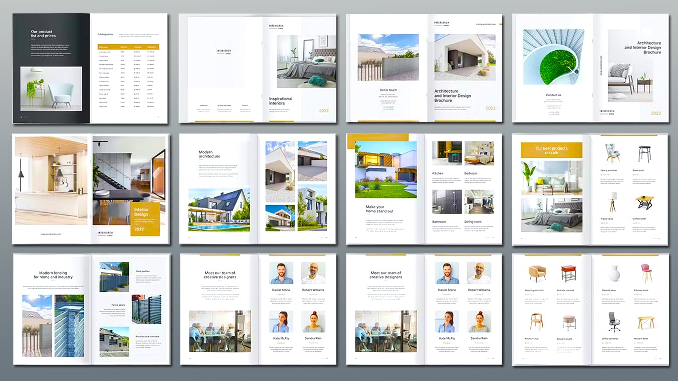
Make your designs stand out with neutrality. This template maximizes the colors black, white, gray, and brown to bring out a minimalist aesthetic that's sure to please the eye. Format-wise, this style is a match for almost any design.
6. The Modern Edge
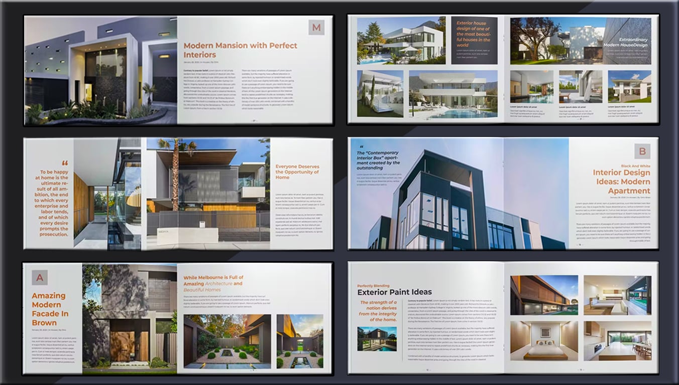
Highlight your edge with a modernist template. This allows you to present your designs with ample space for visuals. Moreover, it is readily editable to accommodate your text descriptions and images.
7. Deep Into Contrasts
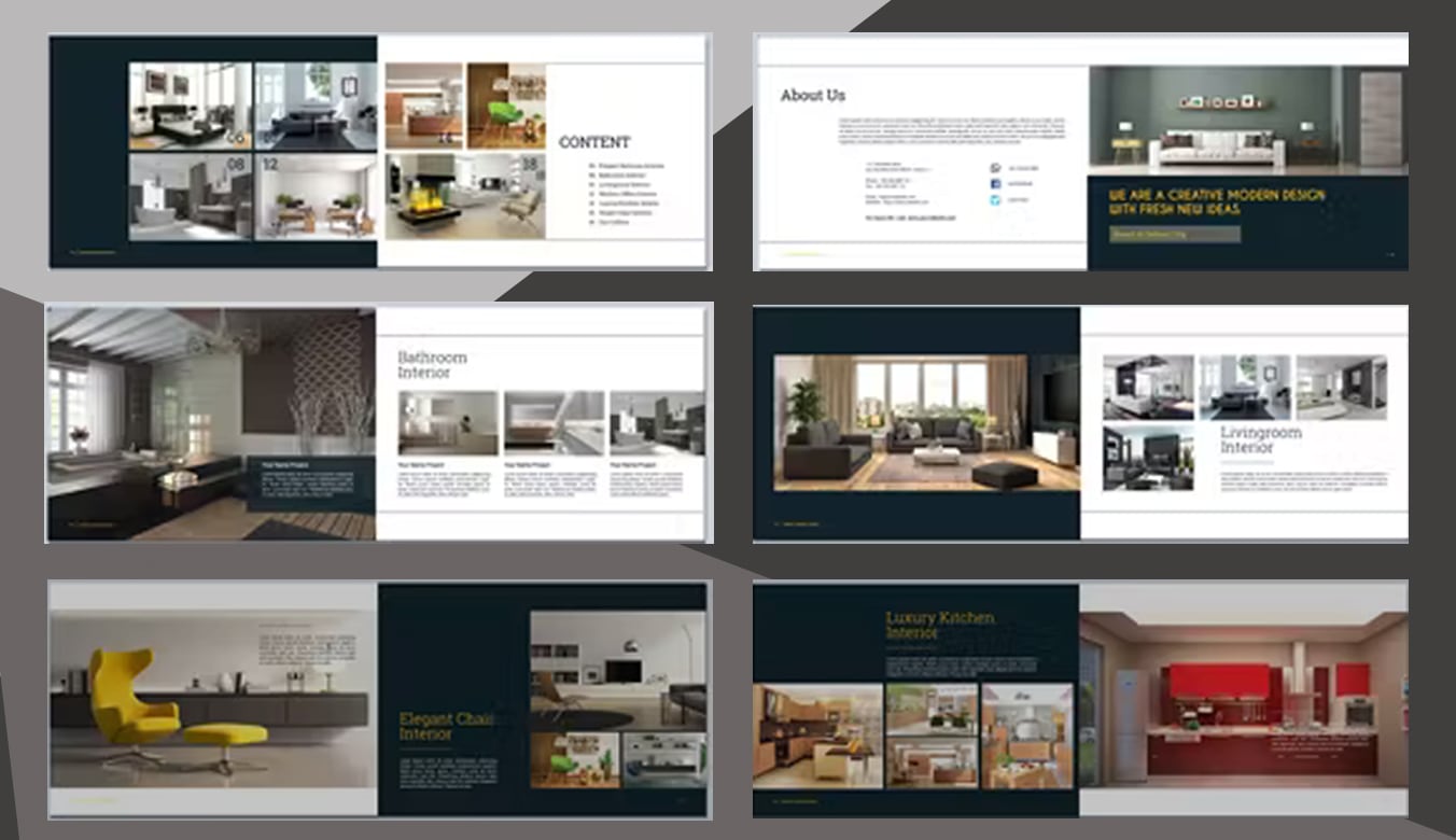
Directing the eyes to the focal points of images and texts, this portfolio uses just the right amount of contrasts between colors. Bring out the best in your designs with a minimalist yet stylish take using this template.
8. Portfolio Layout with Grey Accents

Don't be afraid to show you are a rounded and knowledgeable architect with this simple, clean, and striking template with dominant grey accents.
9. The Elegant Minimal Layout

Elegance with a bit of an edge. That's what this unforgettable template has in store for you! The simple color palette, the professional appearance, and the striking layout all come together in an elegant design.
10. The Structured Portfolio

Presenting your work in a powerful and appealing way has never been easier. This template frames your text and photos with basic white backgrounds and bold headings.
11. The dominance of the Pink and Blue Accents

This template features: a landscape orientation, bold typography, and a wonderful color palette. Furthermore, the layout allows a neat organization for each project, a creative line element, and great text placement. Overall, it is a well thought-out template.
12. The Professional Template

Simplicity and professionalism over everything! This template stands out with its tasteful and uncluttered look. It's hard to find such and elegant and professional design amid all the different architecture portfolio templates.
13. Just The Right Light
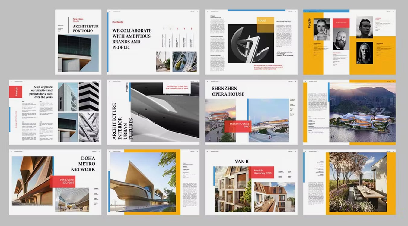
Let your portfolio pop with light colors without overpowering your designs. Use this template to showcase your work against just the right tones of blue, red, and yellow. At the same time, flip through a variety of layout options ready to hold and highlight your visuals.
14. Simply Straightforward
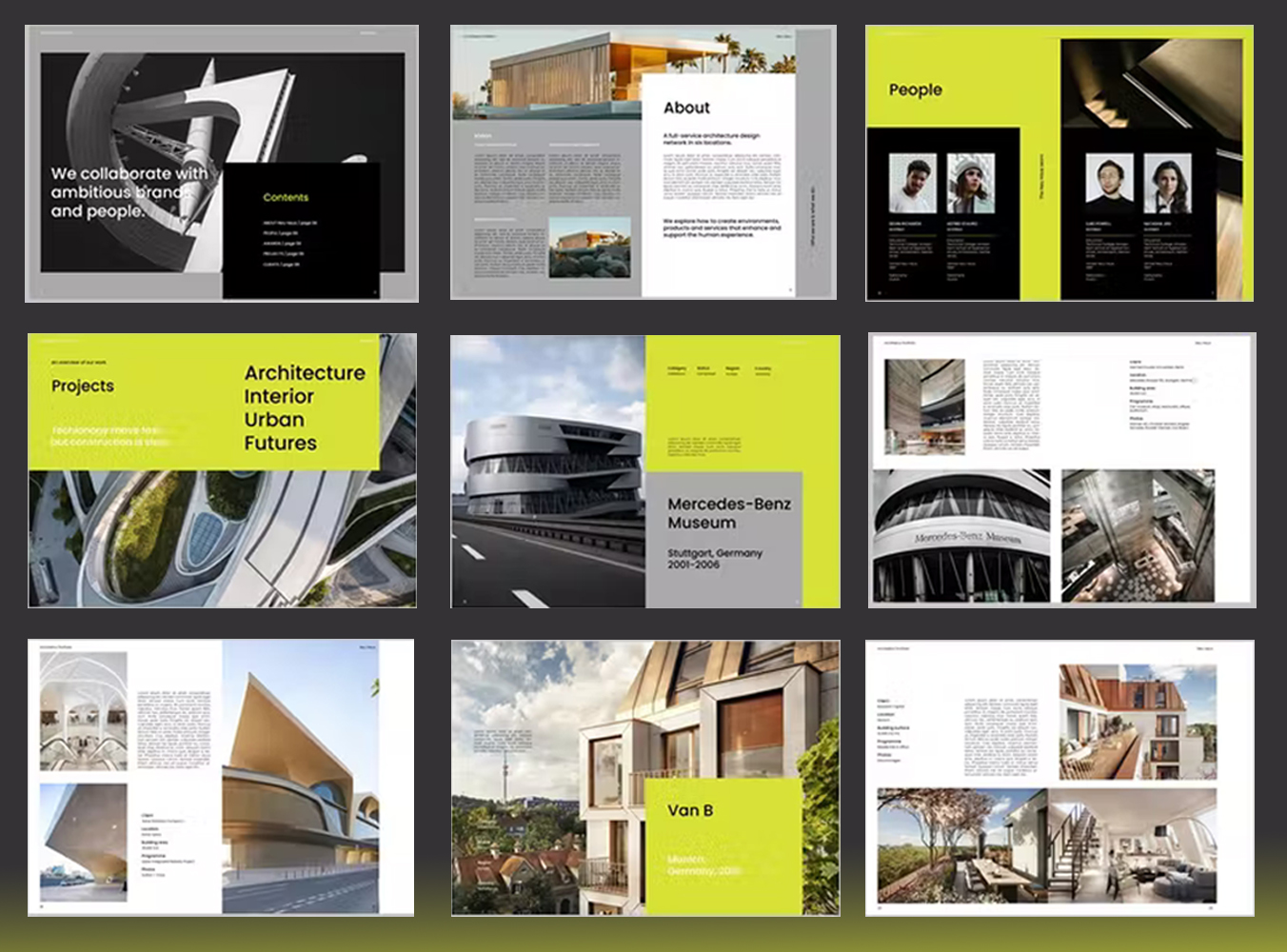
Your style will speak for itself with this simple and straightforward template. Avoid clutter and unwanted elements that might distract the eyes. No overwhelming texts and lines; just pure focus on your designs. Because that's what your portfolio is about, right?
15. Plain White Spotlight
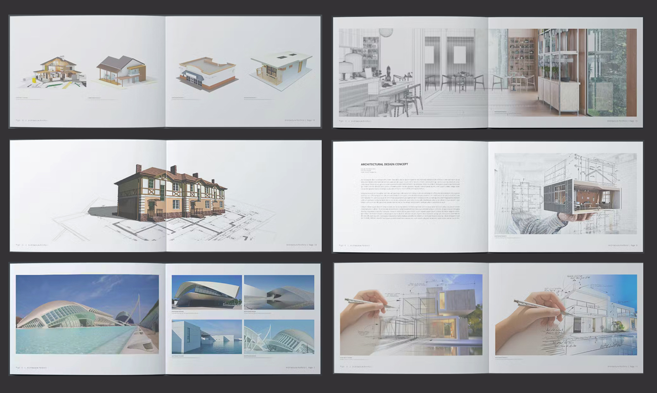
Place the spotlight on your designs by keeping the plain white stride. Take the minimalist style with a template that's provident in text but rich in visuals, allowing you to achieve a neat and pleasing landscape portfolio.
16. Bold Is Better
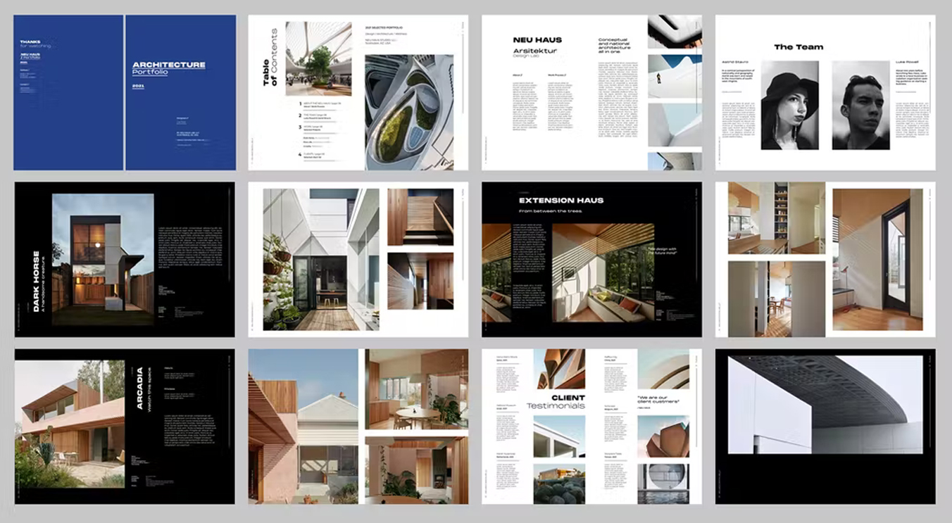
Strike strong with deep blue and black hues to back your bold designs. Along with straightforward texts that help deliver your concepts neatly. Use this template to showcase your work in as easy as 1, 2, 3 — just place, edit, and print!
17. The Grayscale Superiority
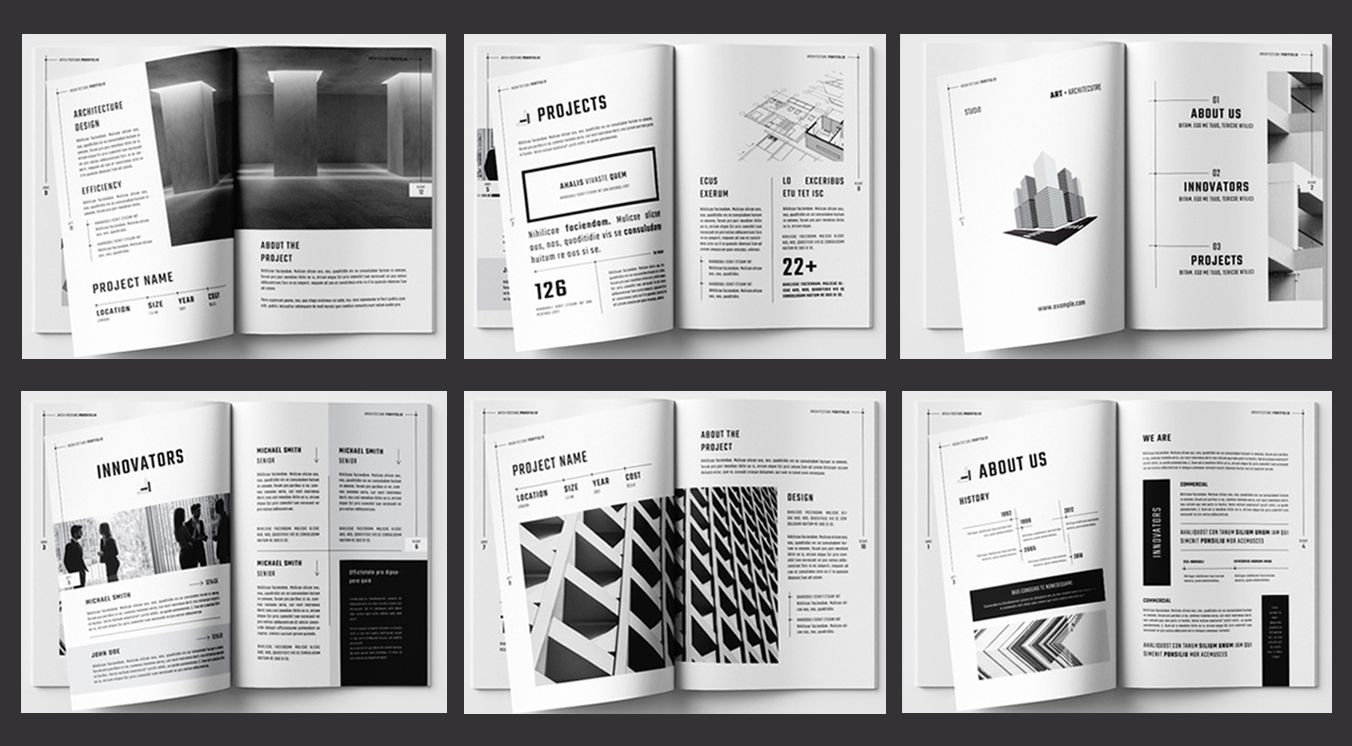
You can never go wrong with black and white, especially when it comes to a dapper portfolio. With dark lines and font styles that complement the plain background, this template will surely give your designs the superiority they ought to have.
18. Towards The Visuals
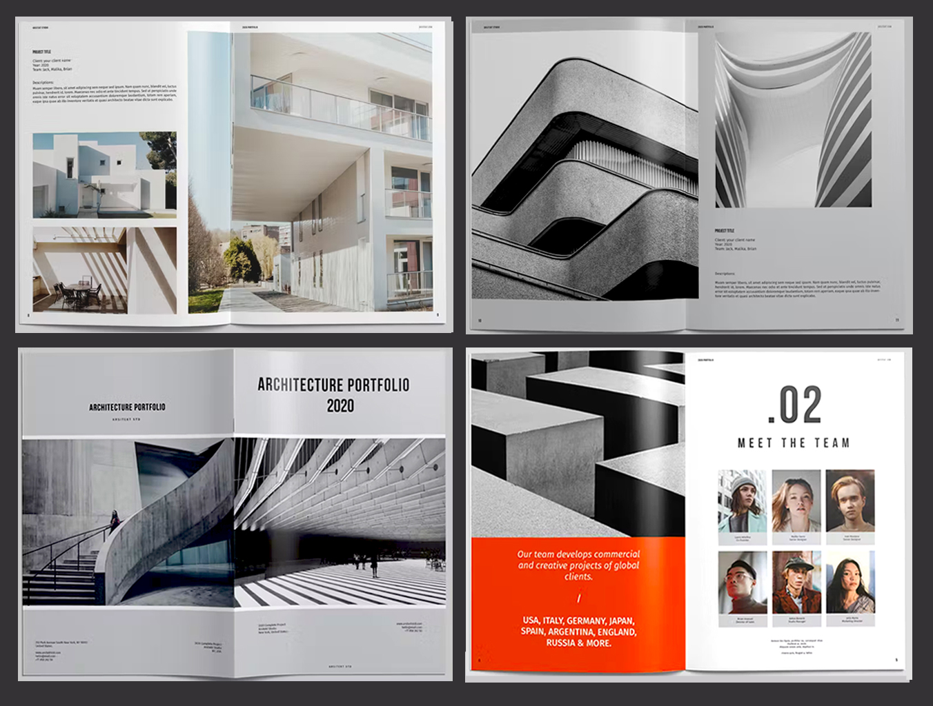
Skip detours and direct the focus on your visuals with a foursquare portfolio. This template is space-rich for your images but does not compromise necessary texts. And with a grayscale base, the pages pop to a bright orange that will enhance your designs' appeal.
19. More Black, More Impact
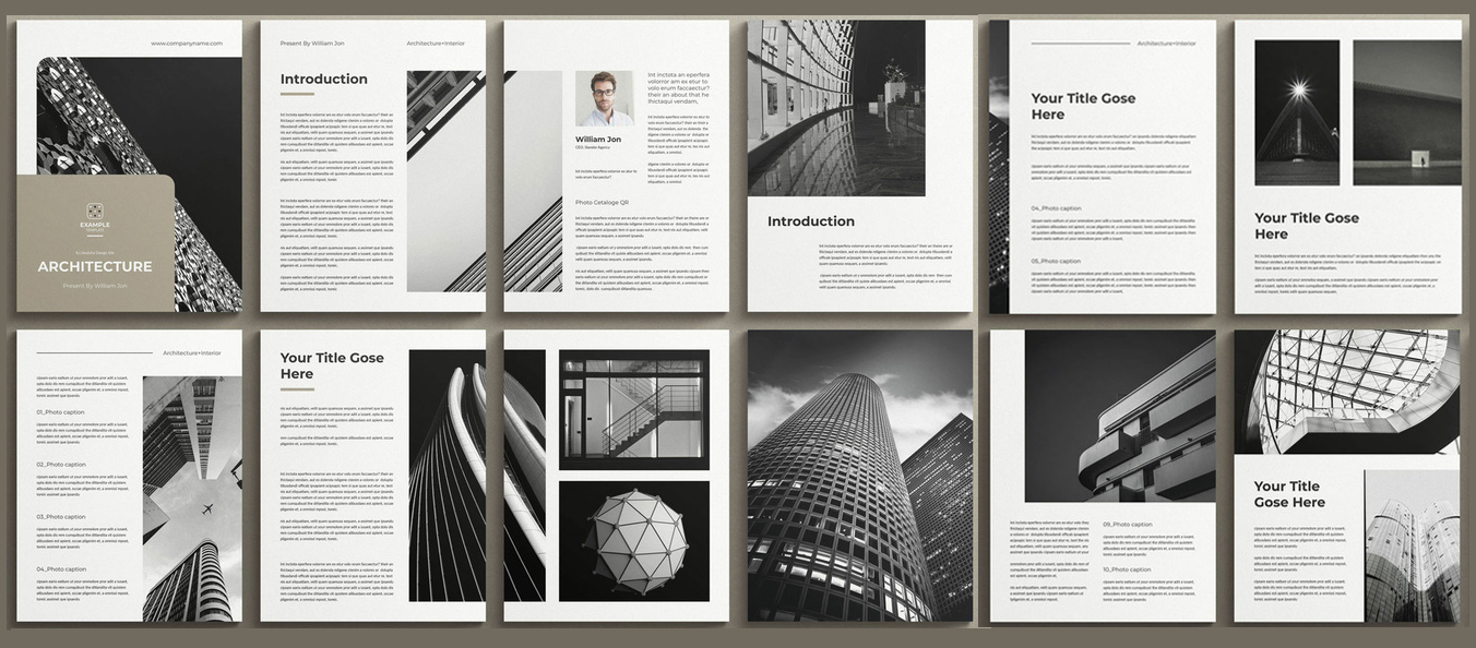
If your stock is mostly black, a white portfolio with black and beige accents is your way to go. Use this template to flash the beauty of your concepts and designs with maximal impact thanks to the balanced arrangement of visuals and texts on every page.
20. The White Dominance
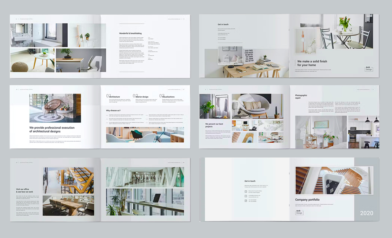
Present your work under the perfect light — white! With this landscape portfolio template, you get the space your visuals need and the text styles that complement them. This way, your designs will hold the gaze of your readers with relaxed eyes.
21. Skies For Heights
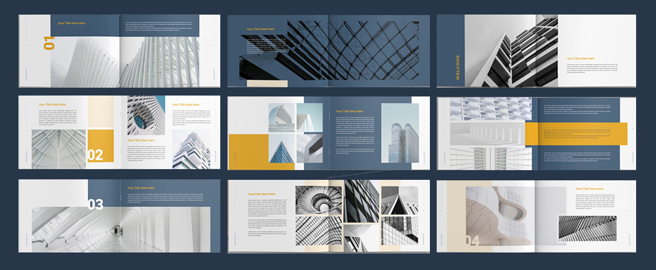
Achieve greater heights with a portfolio that perfectly showcases your designs. This landscape template has a blue undertone with yellow accents that give off a cooling appeal. Here's your best match, especially if your visuals are enhanced by skies.
22. Foursquare Freedom
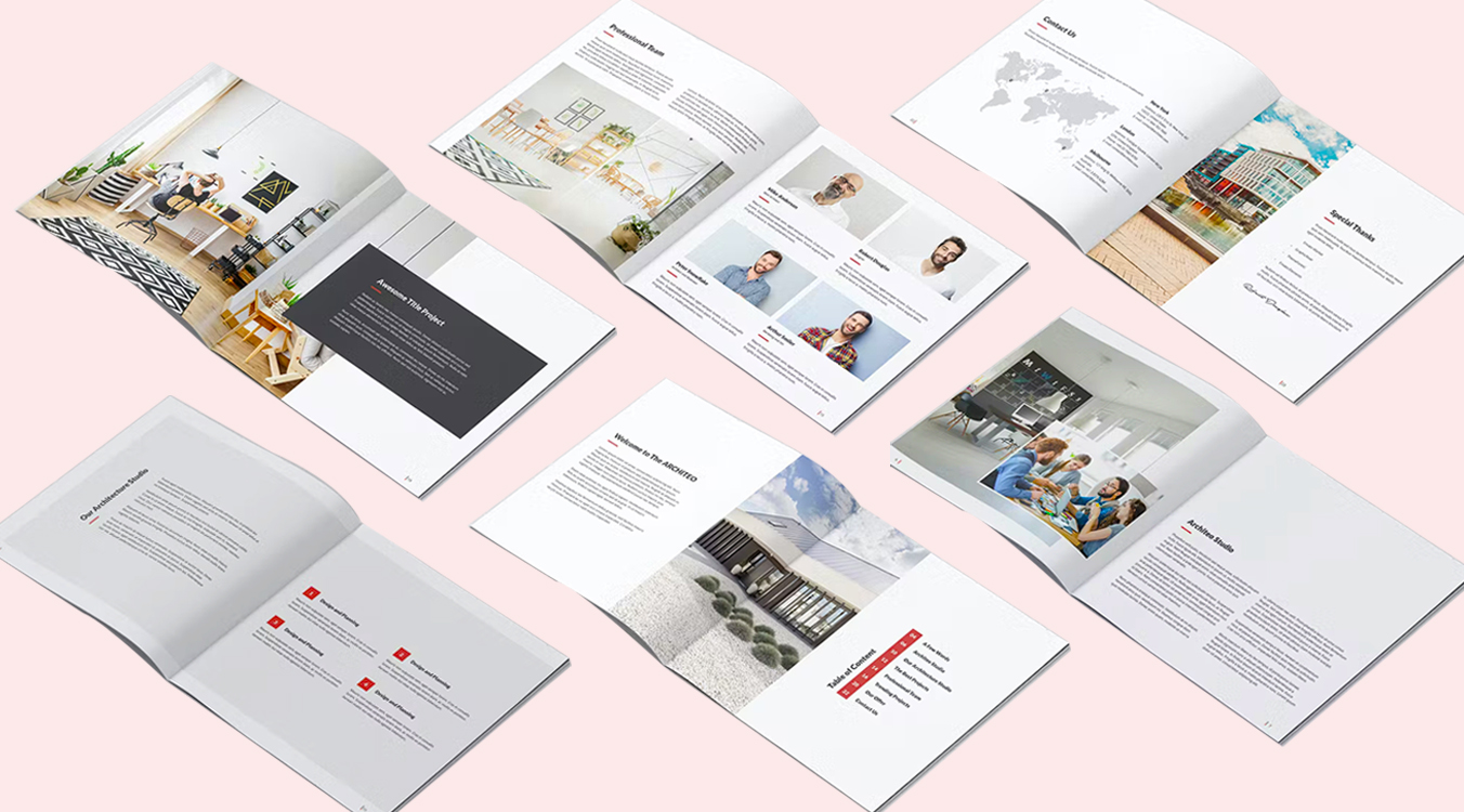
Deliver your concepts and ideas with a text-rich and visuals-dominant portfolio. Use this straightforward square template to present your designs on point while sharply laid out on plain pages. And feel free to customize the font styles, colors, and more!
23. Neon Perfection
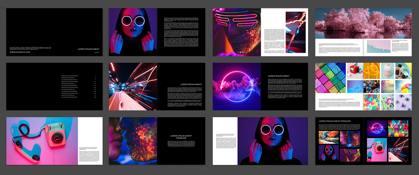
Set your neon visuals to flight with a portfolio that is boldly black and white. Customize this square template with your own images and texts to showcase your best designs against pitch black and pristine white fonts and backgrounds.
24. All About Clarity
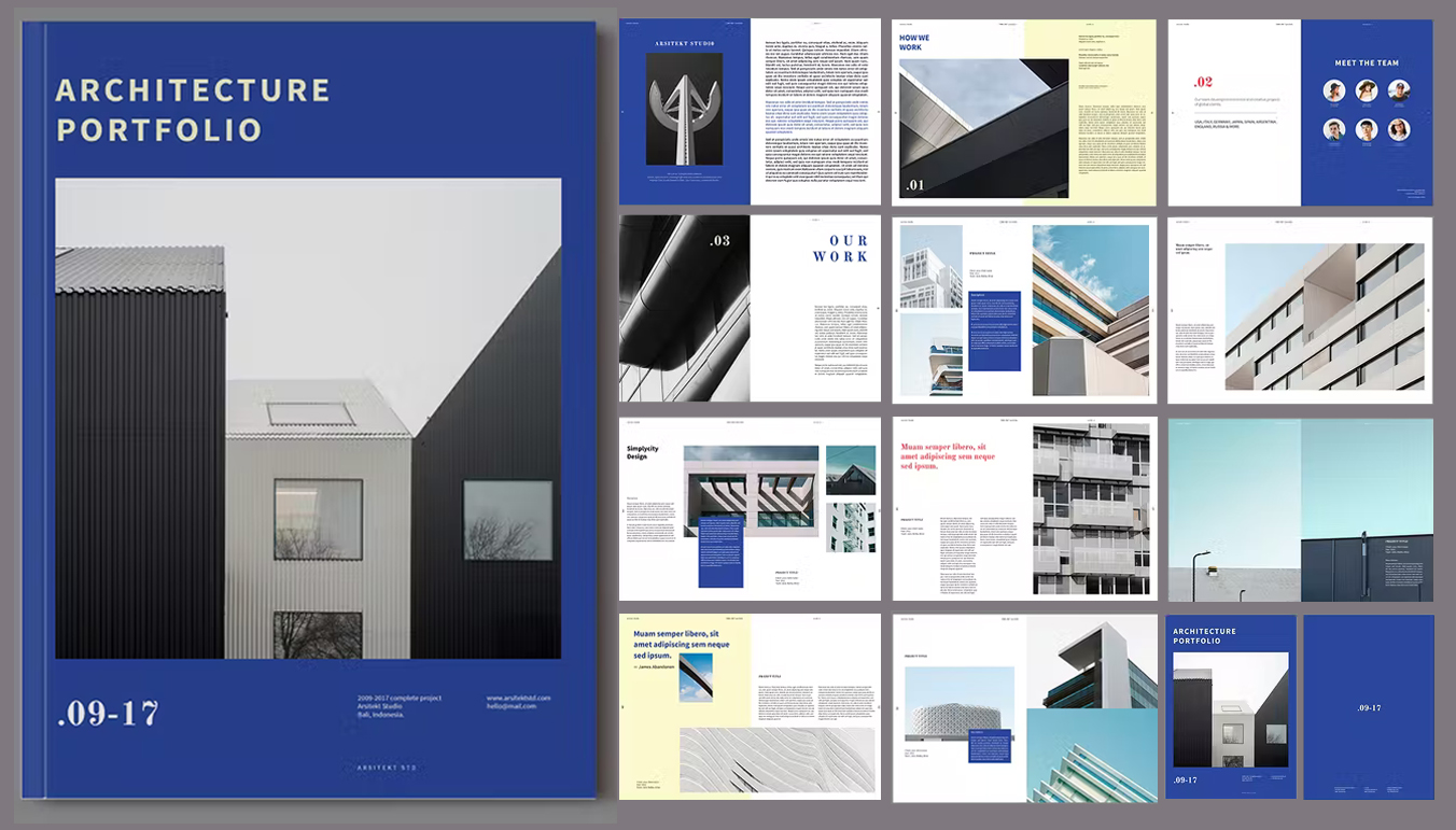
Lay your designs and ideas straight to the point using this cleanly organized template. With blue and yellow accents, here's a portfolio that is sure to feature the best of your works. Make it your own by editing the texts and adding your images!
25. Bright Millennium
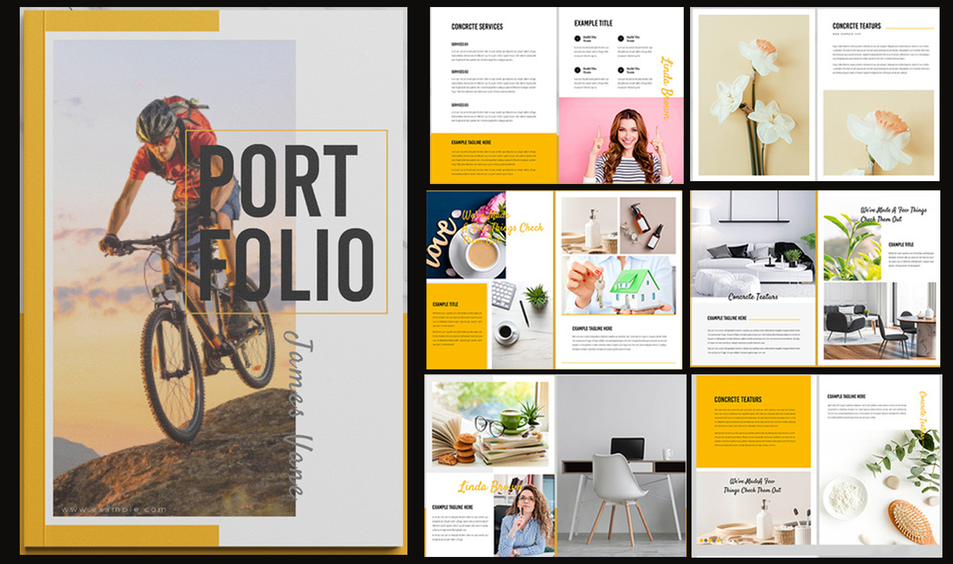
Focus on the bright side of your designs with this magazine-style template. Flip through pages of fun fonts and eye-catching visuals with yellow accents. All you have to do is edit the texts, add your images, and personalize the portfolio to your liking!
26. Eyes On The Black
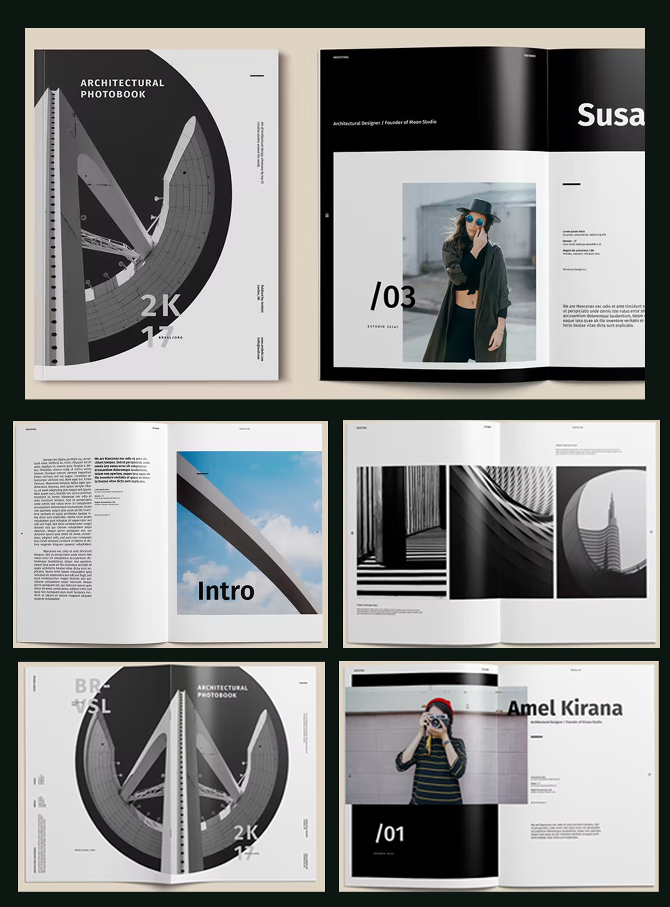
Arrange your designs on black background and patterns that take contrast and focus to the next level. Best for images with defined lines and minimal light, this template will give you an edge when it comes to architecture portfolios.
27. Minimalist White Elegance
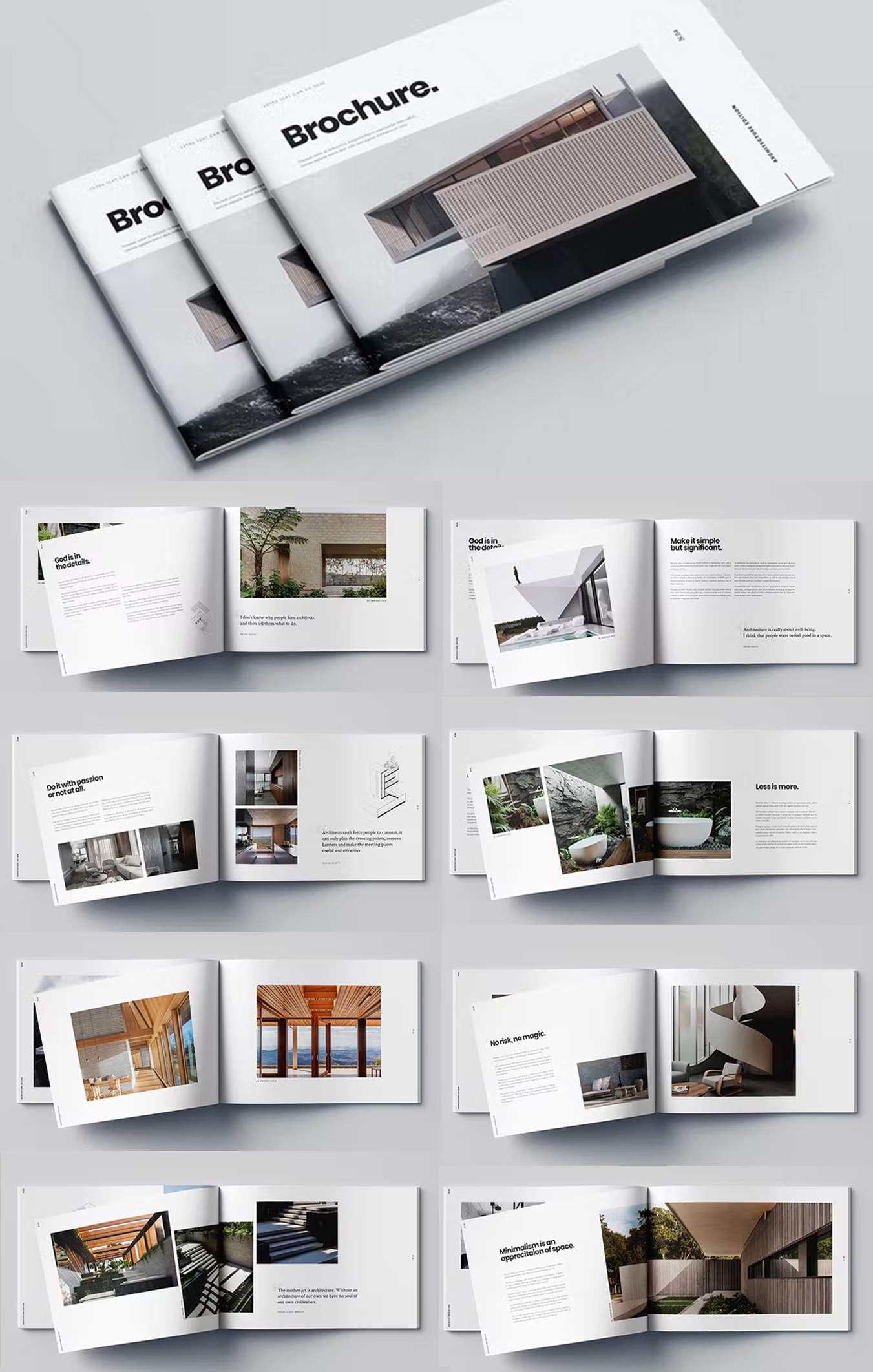
Showcase your work in a classy white portfolio that uses minimal texts, bold titles, and finely placed images. Achieve that neat look that never goes out of style by personalizing this template with your designs!
28. Modern B&W Snaps
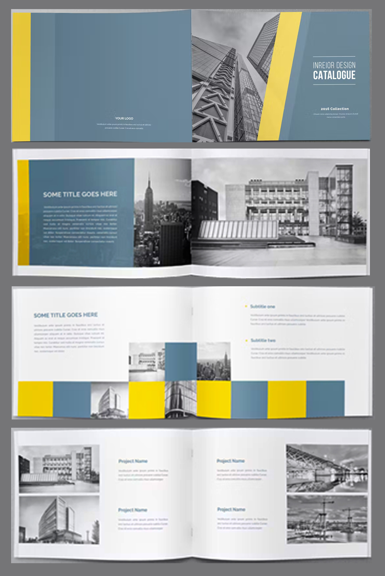
Give your portfolio a modern getup using this well-arranged template. More fitting to black and white images, this template features subtle blue and yellow accents to give your designs a mood lift. Just edit the texts and add your images, then it's ready for printing!
29. Black To The Future
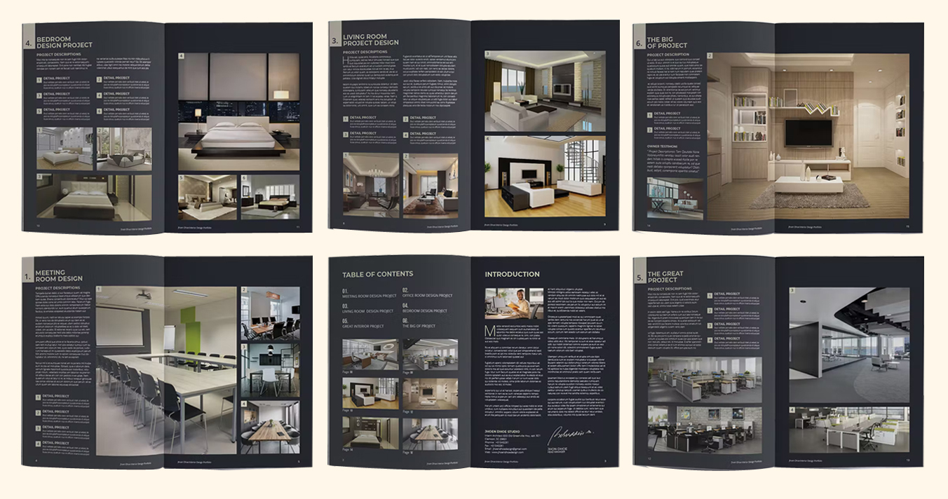
Top the portfolio game with an all-black attack. With grayish brown accents, this template gives a futuristic class that will make your designs appear top-notch. It's ready to hold your images and carry your texts in just a few clicks!
30. Nature Meets Style
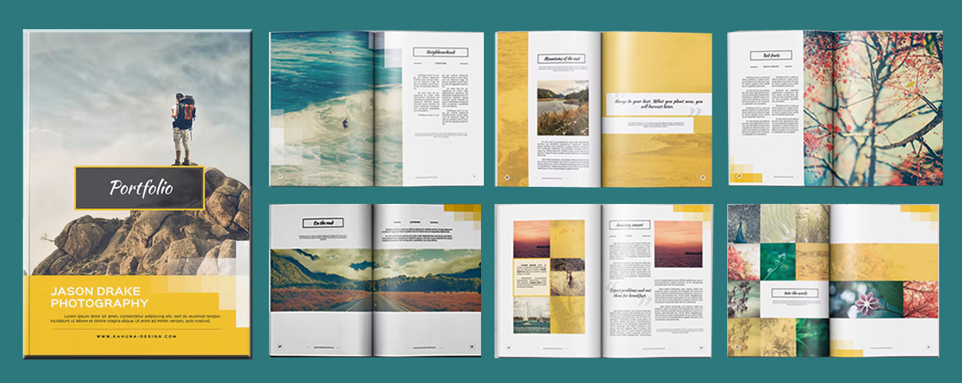
Dive into the warm vibes of nature as you feature your designs using this simple yet stylish template. Don't fret about effectively placing your images and texts because the layout is all ready to present your work. Just place and print!
31. Pale Green Photo Album

Meant more as photo album, this InDesign template is just a few customizing clicks away from an architect portfolio.It has a rather impressive design that allows you to make a powerful presentation of your work. All in all, it's definitely worth your time!
32. The Orange Accents

This template has: versatile A4 spreads, interesting colors, customizable elements, and practical sections. Minimal and simple yet effective and user-friendly.
Architecture presentation templates
33. The Black Elegance

Unlike most classic portfolios, this template has a black background. This seemingly small detail adds sophistication and elegance. Choose this template and take your content to another level.
34. The Elegant Portfolio Layout

This template shines with simplicity and elegance. The images take the spotlight, while the text placement is limited. The color palette is basic. Its overall feel is very polished.
35. Subtle Sophistication
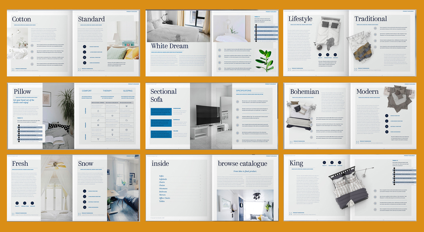
Go for a clean but sophisticated look by using this square portfolio template. It is composed of mostly white pages with subtle blues and grays. Play with the palette and choose the best tones to complement your designs.
36. Dark Blue and White Landscape Book Layout

Well structured and versatile with an elegant choice of colors. This InDesign template is the superior tool you need to visually showcase your experience.
37. Landscape Portfolio Layout

In a profession that revolves around aesthetics, a sleek visual presentation of yourself is necessary. This portfolio provides that and more: versatile layouts, great picture placement, carefully-placed text, and creative circle elements. In other words, for all other architecture portfolio templates, this is the one to beat!
38. Grey Photo Album Magazine Layout

Subtle, delicate, and detailed. Structured, convenient, and easy to customize. Choosing this template means showing your work in an efficient and straightforward way.
39. The High-Class Architecture Portfolio

Choose this template and play it safe! With its polished appearance and powerful presentation, you will keep your readers engaged.
40. The Unique Landscape Design

This design is innovative and unconventional. Its unique picture element really stands out. Each page allows you to tell your story and your creative process, from the idea and primary sketches to the final execution.
41. Visuals Dominant Portfolio

Instead of long paragraphs and complicated explanations, let the images, renderings, drawings, and diagrams speak for themselves. This template will allow you to do just that‚ visually present your experience and your work in a professional and powerful way.
42. Square Architecture Portfolio

Minimalist, chic, and elegant at the same time. This architecture portfolio template will impress you with its simple yet effective design.
43. The Colorful Combination

What makes this layout unique and eye-catching is its striking color palette. Dare to go where few other architecture portfolio templates have gone before!
44. Landscape Portfolio Layout with Bright Colors

Redefine the classic portfolio. This template's bright and refreshing color palette and its neat layout really make it stand out. It's the right choice for any professional ready for success.
45. Graceful Layout

Minimalism goes often hand in hand with architecture. For instance, in this InDesign Template. The pages are simple, the text placement is limited, and the colors are in greyscale. However, the layout is versatile, stylish and timeless.
46. Minimalist Portfolio Layout

Are you looking for a layout that will allow you to display your sketches, images, renderings, drawings, graphs, and diagrams in a simple and uncluttered way? Click on this template and your search will be over.
47. The Creative Structure

What makes this template unique is the creative picture element on every page, though the pages themselves are versatile. The different projects can be neatly organized, the headlines are bold and clear, and the typographic style is easy to read.
48. The Refreshing Portfolio Design

This InDesign template will win you over with its refreshing design and overall layout. The content is easy to read, the picture placement is appealing, and, above all, it allows you to tell your story at a glance.
49. The User-Friendly Portfolio Layout

This template is outstanding thanks to its user-friendly layout. The overall design is uncomplicated and easy to understand, the colors are basic, and it has everything you could ever need.
50. The Subtle Artsy Layout

Contemporary and edgy, this template has bold typography, plenty of picture placeholders, and a lot of space for text. Explain who you are in a modern and artistic way.
Find your favorite template
We carefully curated all the templates you can find in this list. However, if you don't see a template that you like, try using the form below to search among 28,000+ InDesign templates.
Conclusion
Portfolios can be complicated to put together. I believe these architectural portfolio templates can help you focus on what's truly important: highlighting your talent and your projects.
Instead of worrying about the layout, structure and colours, just pick a template and customize it to your liking. I'm confident these InDesign templates can help you advance in your career!
All the best,
Stefano


