As an InDesign user, one of your tasks is to ensure that your documents are translation friendly. But having analyzed thousands of documents, I found only a few that were optimized for translation.
The risks
The risks of working with documents that aren't translation-friendly include:
✘ Expending more time, energy, and money on a project than necessary
✘ Causing the translator to make mistakes
✘ Introducing mistakes yourself
✘ Overlooking and failing to translate parts of the documents
✘ Having a hard time updating documents at a later stage
The 10 InDesign mistakes you might be making
1. Using the wrong tools
Using the wrong tools (or not using a tool at all) to create the translated versions of your documents is very dangerous.
One of the most common methods to translate an InDesign document is by exchanging Word or Excel files with translators and copy/pasting the sentences from one document to another. This method is highly imprecise and can easily lead to mistakes.
Other tools to approach the problem are scripts, plugins or the use of InCopy. Those solutions lack some basic features that you want to have when translating a file (like Translation Memories, import/export of TMs, basic collaboration features, etc.) or might be discontinued and stop working with newer versions of InDesign.
For a deeper understanding, you should check our post: “4 Tools to Avoid When Translating an InDesign document”
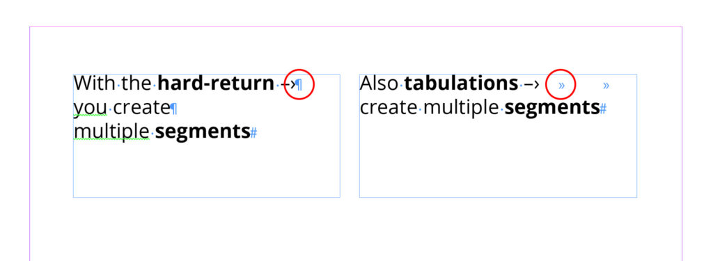
2. Returns and tabulations to break sentence
Using hard returns or a tabulation to break a sentence in InDesign creates two (or more) different sentences in the translator’s tools and that makes it hard for the translator to understand the sentence and translate correctly.
3. Threaded text
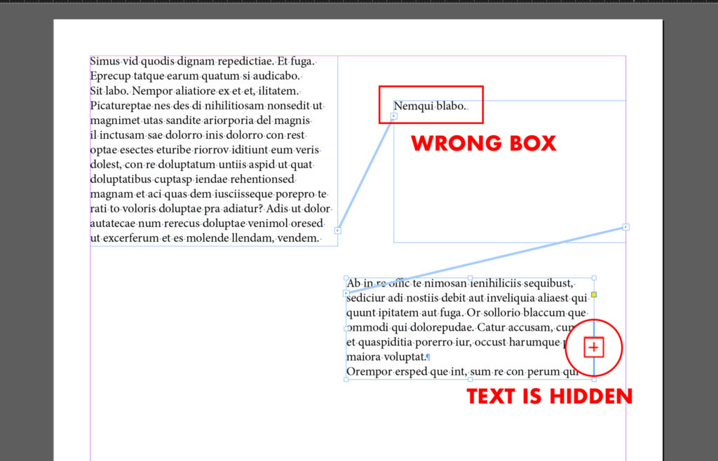
You should think of your text in the InDesign document as if it were dummy text. When that text is replaced with the actual content, you want your file to look the same as it looks right now and the content to be placed on the right page.
I explained a few tactics and secrets about dealing with threaded-text in this post.
4. No overflow space
Some languages take up more space than others. For example, the same content in English translated to German often takes up to 30% more space.
Keep that in consideration and leave some white space at the end of the text to avoid edits in the translated versions of your documents.
5. Tabulation and spaces in the middle of sentences
Using tabulations incorrectly or typing spaces in the middle of a sentence will make it impossible to retain the style and layout of your document.
Avoid placing spaces in the middle of a sentence, use margins and tabulations correctly.
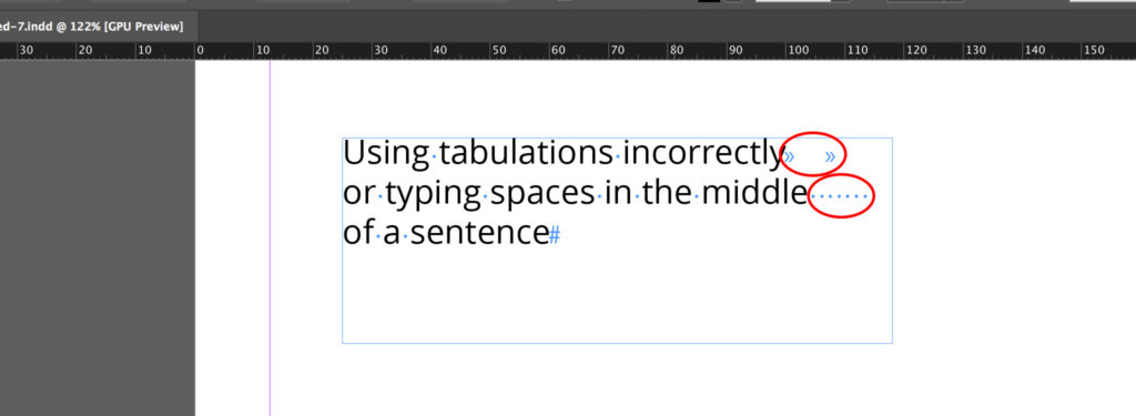
Again make sure your document will have the same look when the text is replaced with a longer language.
6. Bulleted and numbered lists without styles
This is not connected with your layout but with something a little technical that influences translation costs and consistency.
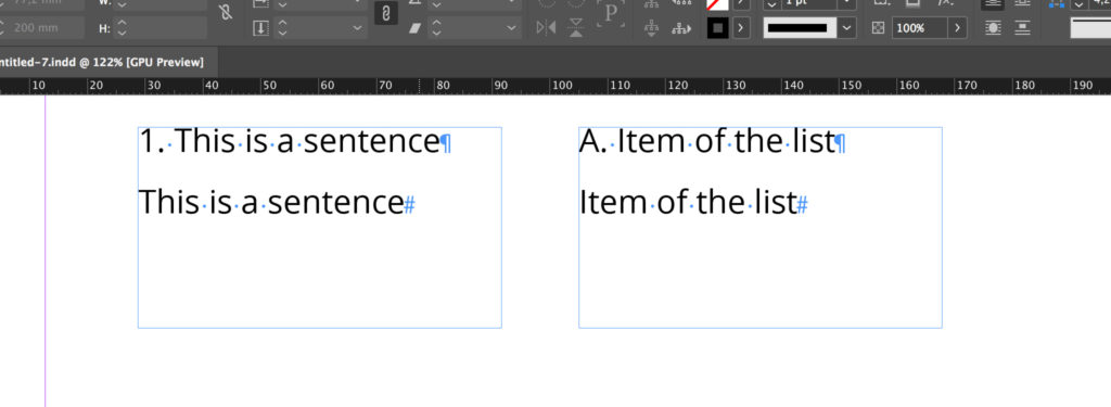
The sentences
- “1. This is a sentence” and
- “This is a sentence”
might look like the same sentence but they are not.
Also the sentences
- “A. Item of the list” and
- “Item of the list”
are different sentences.
This works also for bulleted sentences.
Without the right settings in InDesign, the translation tool cannot interpret those two sentences correctly. If that happens, the translator has to deal with the numbered list without using any automation.
Besides having more content to translate, not using the Paragraph Styles to create bulleted and numbered lists might create inconsistency in the translation.
Make sure you read these two articles that go into details about the proper creation and usage of the InDesign Numbered lists and Bullet points.
7. Images to localize
Having images to translate makes it harder and more time-consuming to create multilingual versions of your document.
An image with text inside is unique to the language version of your document and you’ll need to replace it manually in the translated document.
Translated images dramatically increase the chance of errors.
Check this post for more information on how to deal correctly with images in InDesign.
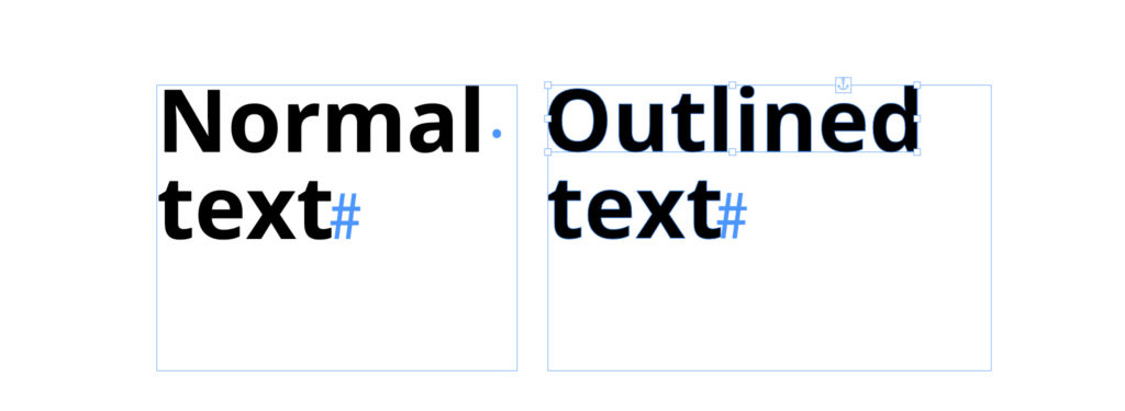
8. The use of outlined text
When a text is outlined, InDesign doesn’t recognize it as textual content anymore. The outlined text becomes an image and so it’s impossible to translate and its translation might be forgotten.
Having unanswered questions about when and how to actually use it? Read this detailed guide about it.
9. Layout with many languages (2 or more)
I feel a little like Don Quixote fighting against the windmills because this point is also a personal battle.
I don’t appreciate layouts with more than one languages — not even in catalogs — because the User Experience is awful. The reader can get lost and reading the content takes more time.
Besides all of that, with layouts that have more languages (2 or more) on the same page/spread—you make it impossible for yourself or the translator to use a tool to translate the content.
Not using the right tool harms the quality of your documents. It makes it harder to translate the document, increases the chance of error, and lowers the consistency.
If you can choose, avoid layouts that are not single language.
10. Communicate badly with your colleagues or your vendor
Communicating properly with your vendor or your colleagues is very important.
- Make sure your document is translation-friendly
- Always provide them with a PDF of your document
- Integrate the right tool into your workflow
The ideal solution
If you often work with InDesign documents that need to be produced in many languages (Catalogs, User Manuals, Brochures, etc.), you might want to try Redokun.
With Redokun you can:
- Drastically reduce the time spent getting the documents translated
- Significantly cut down on translation expenses
- Reduce time spent on updates and revisions
Try Redokun for free for 14 days.
Tips for optimizing other document types
Check out our other resources on how to prepare different document types for translation:


