

Why does file setup matter before translating an InDesign document?
Most layout problems in translated InDesign files don't start during translation. They start before it, in how the source file was built.
A poorly prepared file creates a chain reaction: incorrect segmentation trips up translators and CAT tools, missing glyphs show up as red squares, overflowing text forces a designer to manually reflow every text frame in every language, and inconsistent styles mean reformatting work multiplies with each new language.
A well-prepared file, by contrast, can come back from a translation tool requiring little to no designer intervention.
A translation tool like Redokun is:
Best for: Marketers, designers and technical writers who create InDesign documents that will be translated into multiple languages.
Not best for: One-off documents in a single language where translation need is limited to one language.

40 tips to optimize InDesign files for translation
What is a translation management tool,and why does it affect how you build your InDesign file?
Definition: A translation management system (TMS) is software that helps teams complete translation projects faster and more consistently by automatically extracting and breaking text into segments so translators can focus on translating text, rather than worrying about preserving layout and format. It also offers features to help manage terminology and store approved translations in a Translation Memory (TM) for reuse across future projects.
How you build your InDesign file directly affects how well a a translation management system like Redokun can process it. Bad segmentation produces incomplete, out-of-order text that's hard to translate and can't be matched by Translation Memory. Good file structure produces clean segments that translate efficiently and reuse automatically on future projects.
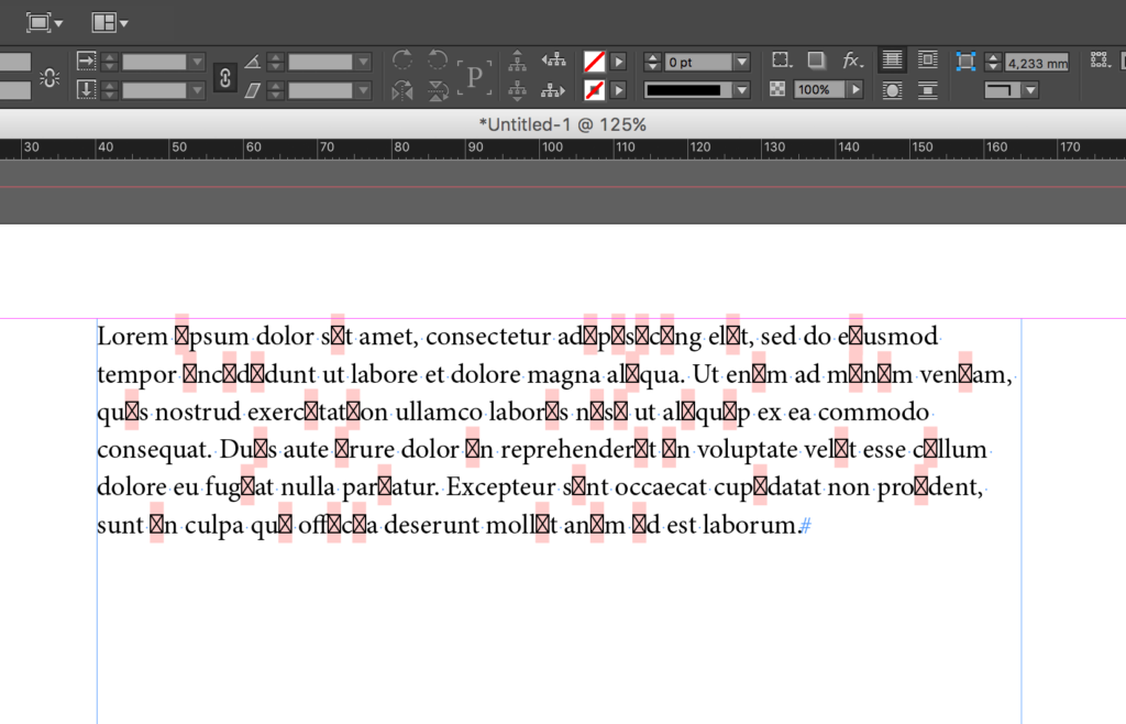
Step 1: Show hidden characters
Why this matters: Hidden characters — also called control characters — are invisible in your document but actively shape how text flows. Seeing them lets you catch formatting issues that would otherwise surface as layout problems in the translated file.
Hidden characters include paragraph marks, soft returns, tab characters,non-breaking spaces, and forced line breaks. Each affects how a CAT toolsegments your text.
How to turn them on: Go to Type → Show Hidden Characters in InDesign. Make it a habit to review your document with hidden characters visible before sending any file for translation.
Learn more: How to show hidden characters in InDesign
Step 2: Avoid inline styles
Why this matters: Inline styles applied element-by-element are time-consuming to manage in one language and become a serious problem when every language version needs the same formatting applied manually.
Inline styles work fine for one-off design decisions. But when a document needs to be translated into multiple languages, manually reapplying styles across all text frames in each language version is slow, inconsistent, and error-prone. Use paragraph and character styles (Step 3) instead.
Step 3: Use paragraph styles and character styles
Why this matters: Paragraph and character styles give you centralized control over how text looks across the entire document. They make translated files far easier to adjust and ensure style information survives the translation process intact.
Character styles define formatting at the character level: font family, style, size,language. Use them for inline emphasis — bold terms, superscripts, italicizedproduct names.
Paragraph styles define formatting at the paragraph level: all character attributes plusindent, spacing, alignment, and hyphenation. Use them for every body textblock, heading, caption, and list.
Text expansion note: Languages like German run 20–35% longer than English. With paragraph styles defined, you can adjust the font size or tracking for an entire language version in seconds rather than frame by frame.
When a font is missing a glyph for the target language, InDesign replaces it with a red square. With a paragraph style in place, switching to a font with full coverage takes one step — change the style and every instance updates instantly.
Learn more: Adobe's guide to paragraph and character styles · How to use InDesign paragraph styles
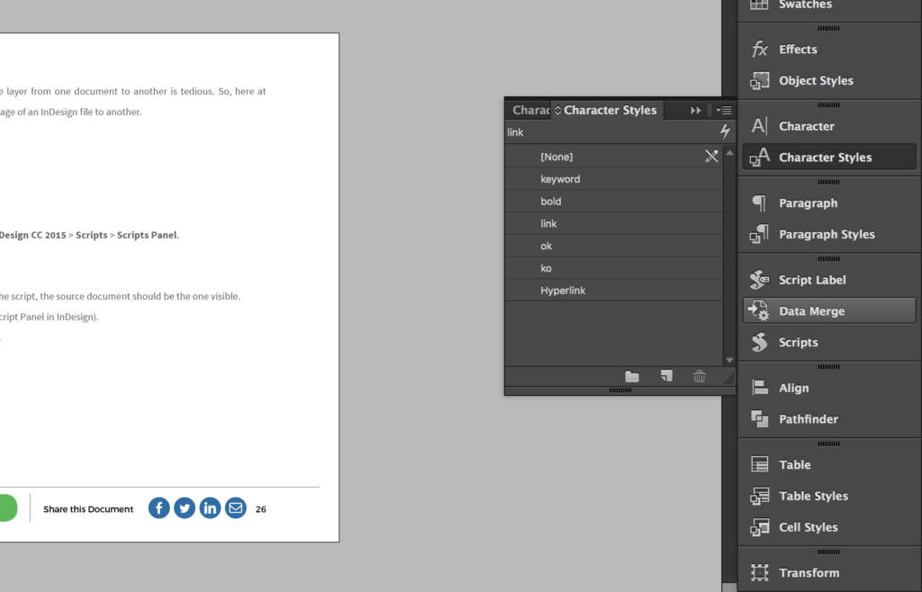
Characters styles
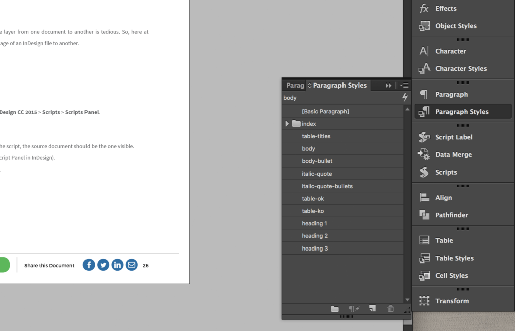
Paragraph styles
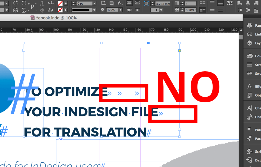
Step 4: Choose fonts with full glyph coverage
What is a glyph? A glyph is a specific visual form of a character. The letter"A", for example, exists in different forms: capital, small cap, accented (À, Á, Â). Each is a separate glyph. Every language has its own requirements, and not all fonts cover them.
Why this matters: If your chosen font doesn't contain the glyphs needed for a target language, InDesign replaces missing characters with red squares throughout the document — requiring a full font swap before the file is usable.
Every language might contain a huge array of different Glyphs. So how do we find the fonts that contain all the characters we need?
Sadly InDesign has no integrated feature that can help us to search for a particular glyph. You can only visualize all the glyphs contained in a specific font.
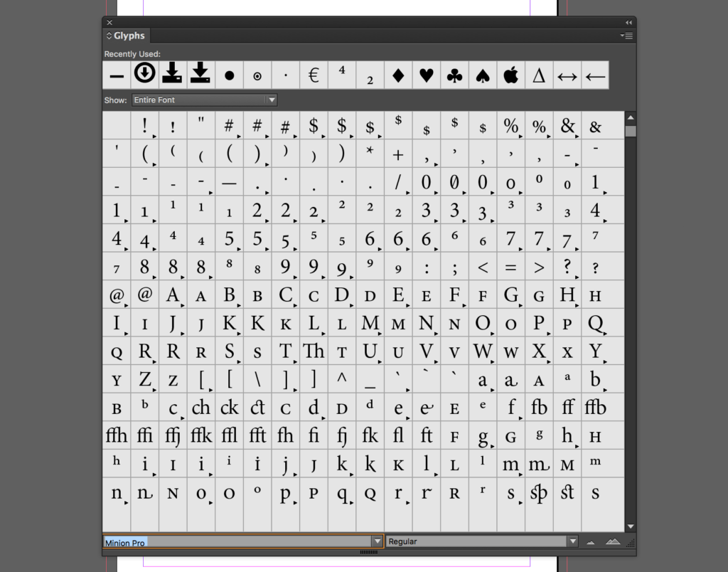
How to check glyph coverage
- In InDesign: Type → Glyphs to browse all glyphs in a specific font.
- For a cross-font comparison: the Unicode font table on Wikipedia lists which fonts cover which character sets.
- To check a specific glyph in a specific font: InDesign Secrets guide.
Choosing the right font before you start is far easier than replacing itafter translation, when red squares are scattered across hundreds of pages.
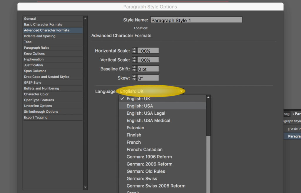
Step 5: Set the language attribute
Why this matters: The language attribute controls spelling and hyphenation rules inInDesign. Setting it correctly per paragraph style ensures hyphenation behavesproperly in each language version and InDesign's spell-check works against theright dictionary.
Language is a character-level attribute that can be set within aparagraph style. For every paragraph style you define, set the language tomatch the source document. When the file comes back translated, the languageattribute in translated text should be updated to the target language.
How to set it: Select text → open the Character panel → use the Languagedropdown to choose the appropriate language.
Step 6: Use paragraph indent insteadof spaces and tabs
Why this matters: Spaces and tab characters used for visual indentation are often strippedby CAT tools, produce incorrect segmentation, and prevent Translation Memoryfrom matching content that should be reused automatically.
Using multiple spaces or tabs to align text creates three problems intranslation:
Broken segmentation. CAT tools sometimes strip non-visible characters, causing translatedtext to lose its indentation — forcing manual reformatting in every language.
Bad Translation Memory matching. Stray spaces become part of the segment. A segment with spaces beforethe text won't match the same segment without them in Translation Memory, evenif the actual words are identical. Your team pays to translate content thatshould be reused for free.
Visual inconsistency. If the target language is longer or shorter, spaces and tabs producedifferent visual results. A proper indent defined in a paragraph style adaptsautomatically.
The fix: Set indent values in the paragraph style editor or Paragraphpanel — never use spaces or tabs to indent text.
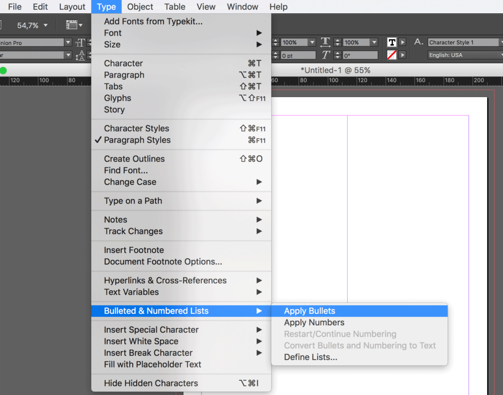
Step 7: Use bulleted and numbered lists correctly
Why this matters: Lists created with manual bullet characters or typed numbers embed formatting into the text, creating the same segmentation and Translation Memory problems as spaces and tabs and break automatic numbering when translation adds or removes items.
Use InDesign's native list features, either via the Paragraph panel or by defining a paragraph style with list attributes built in. Native lists produce clean text segments, adapt automatically when content length changes, and renumber correctly after translation.
Learn more: InDesign numbered lists · InDesign bullet points
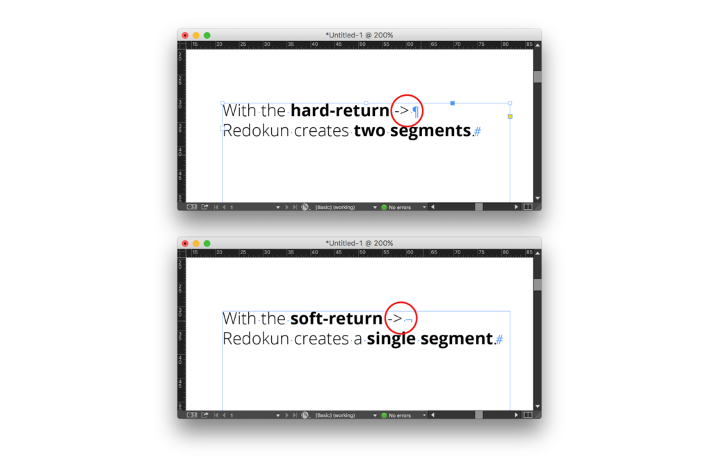
Step 8: Use soft returns to wrap text, not hard returns
Why this matters: Hard returns signal the end of a paragraph to both InDesign and CAT tools. Using them mid-sentence to control line breaks splits one sentence into two incomplete segments — making it harder to translate and preventingTranslation Memory from storing or reusing that content correctly.
Hard return (Return / Enter): end of paragraph. Use only to end paragraphs.
Soft return (Shift + Return): line break within the same paragraph. Use whenever you need to control where a line wraps inside a sentence or headline.
A headline broken with a hard return becomes two separate segments: "With the hard return" and "Redokun creates two segments."Both are incomplete, hard to translate, and useless in Translation Memory.
The same headline with a soft return becomes one complete segment: "With the soft return, Redokun creates one complete segment." It translates correctly, stores correctly, and reuses correctly on your next project.
Quick reference: all 8 steps at a glance
How do you send a prepared InDesign file for translation?
Once your file is set up correctly, the fastest way to translate it without copy-pasting is with Redokun:
- Export as .idml: File → Export → Adobe InDesign Markup (.idml).
- Upload to Redokun: text is extracted automatically, segment by segment, with all styles preserved
- Assign translators and run AI pre-translation (optional): translators work in a browser-based editor with a live page preview; no InDesign license needed.
- Download the translated .idml: layout intact, ready to open in InDesign.
A well-prepared source file means the downloaded translated file requires few or no edits. A poorly prepared one means a designer has to manually fix every language version.
Start a 14-day free trial. No credit card required.
Frequently asked questions
What is the most common InDesign mistake that causes translation problems?
Using hard returns to break lines within sentences is one of the most frequent— and most damaging. It splits sentences into incomplete segments, makes translation harder, and prevents Translation Memory from working correctly. Use soft returns (Shift + Return) for line breaks within a paragraph.
Why do red squares appear in my InDesign file after translation?
Red squares indicate a missing glyph — the font doesn't contain a character needed by the target language. Fix it by switching to a font with full glyph coverage. With paragraph styles defined correctly (Step 3), this change takes seconds across the whole document.
Does translated text always get longer than the source?
Not always, but often. German and many European languages run 20–35% longer than English. Japanese and Chinese may be shorter. Leaving 20–30% of whitespace in text frames gives all target languages room without layout breaks.
What is the difference between a hard return and a soft return inInDesign?
A hard return (Return / Enter) marks the end of a paragraph — CAT tools treat it as a segment boundary. A soft return (Shift + Return) creates a line break within the same paragraph — CAT tools treat everything around it as one segment. Use soft returns whenever you need to control line breaks within a sentence or headline.
What is Translation Memory and why should a designer care about it?
Translation Memory (TM) is a database that stores previously approved translations and suggests them automatically when a matching segment appears in a new project. Clean file preparation (correct styles, proper returns, no stray tabs, etc…) produces clean segments that match correctly in TM. Poorly prepared files produce segments that never match, so your team pays to translate the same content repeatedly.
What is the fastest way to translate an InDesign file after it's been setup correctly?
Export as .idml and upload to Redokun. Text is extracted automatically, translators work in a browser with a live page preview (no InDesign license needed), AI pre-translation and Translation Memory fill in as much as possible, and the translated .idml downloads with the original layout preserved.


