


More often than not, we learn to use InDesign from many different sources: tutorials, articles, etc. This may lead to having incomplete information, and making mistakes without even realizing it!
Learning a new skill, like how to use InDesign, takes time and energy, and that should be rewarded. The last thing you want is to get discouraged by a few mistakes.
That’s why I came up with a list of the 20 Most Common InDesign Mistakes.
This post specifically deals with mistakes anyone could make in InDesign, if you want to learn how to use InDesign check out our post on courses.
Having followed a few of those courses myself, I can tell you what mistakes most commonly occur when using InDesign. We’ve divided them into sections to help you navigate better.
Overview
- Text Layout Mistakes
- Text Placement Mistakes
- Language Management Mistakes
- Image and Color Mistakes
- Function Mistakes
Text Layout Mistakes
1. Not Using Paragraph and Character Style
This might be the most obvious of mistakes. Not using paragraph and character style means using a fraction of InDesign’s potential.
It will take you more time and effort than is necessary only to end up with a mediocre result.
Go here to learn how to use InDesign Paragraph Styles like a pro.
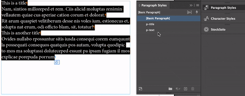
2. Change Settings Locally
Changing settings locally is a mistake that even InDesign itself will point out to you. Take this picture.
That blue background tells us that the changes have been applied locally (in this case, it’s about the text size or color).
Here’s is what I should have done instead: (1) create a new Paragraph Style to be applied to the first two paragraphs; (2) create a Character Style to be applied to “the text”.
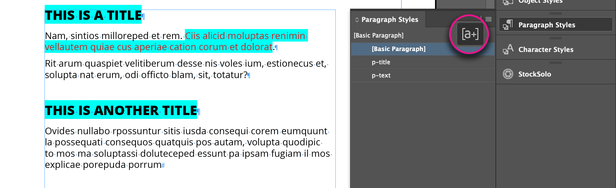
3. Not Showing Hidden Characters
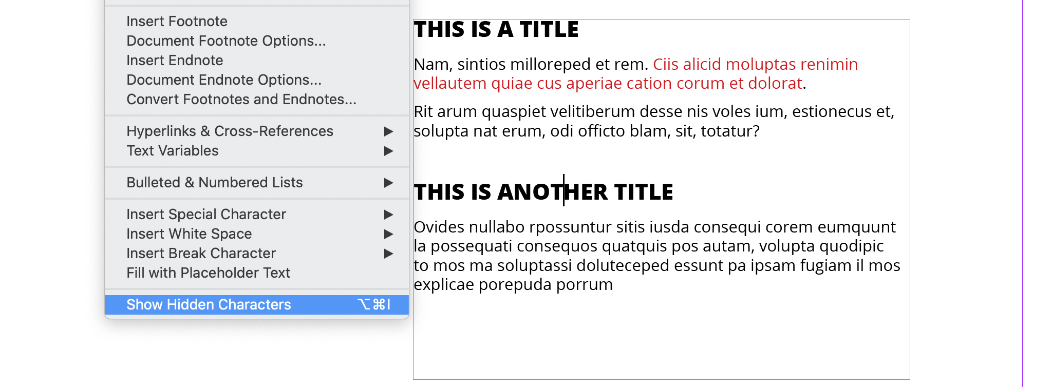
This is one of the most common InDesign mistakes.
You need to be able to control your text, and to do that you have to see all of it, including hidden characters. You can even make this a default setting: close all documents and click on Type > Show Hidden Characters.
See the complete list of InDesign hidden characters and learn everything you need to know about them.
4. Using Enter Instead of a Line Break After Titles
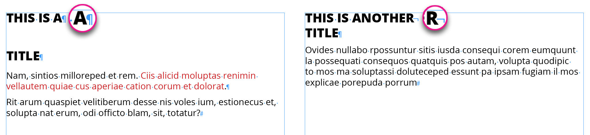
Typing enter in an InDesign text results in splitting the paragraph in two phrases. This can becomes a huge waste of time involving Paragraph Styles and general changes to the text.
The correct way to do it, is by using a Line Break. This way InDesign keeps the two phrases in the same paragraph and you won’t have any problems with Paragraph Styles.
5. Creating Bulleted Lists Using Spacebar or Tab
Another common mistake is to create bulleted lists and putting spaces between the bullet and the text (as you can see in the first example of the picture). Using Tab (as seen in the second example of the picture) might work, but there’s a better way.
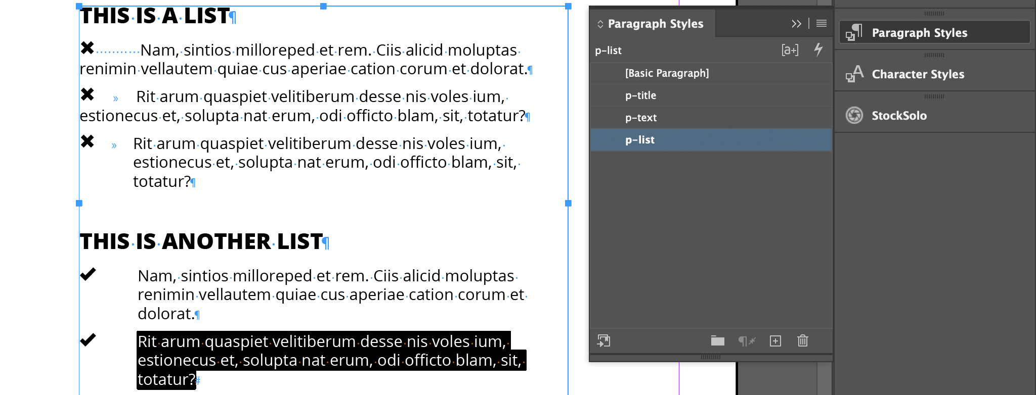
The second part of the picture shows you what a bulleted list looks like if you don’t place anything between text and bullet. That’s because I’m using a Paragraph Style to place the bullets before the text.
Find out how to add bullet points in InDesign. Whether you want to use Paragraph Style (suggested) or local formatting, we've got you covered!
Text Placement Mistakes
6. Using Enter to Space Out Text
Using Enter to space out text paragraphs is a really common mistake. While it may seem like the easiest option, in the long run it will become a pain to try and keep the space and organization between different boxes and frames, the same.
In the two pictures below you can see the difference: even though, the text and characters are the same, the distance between the two blocks of text changes.
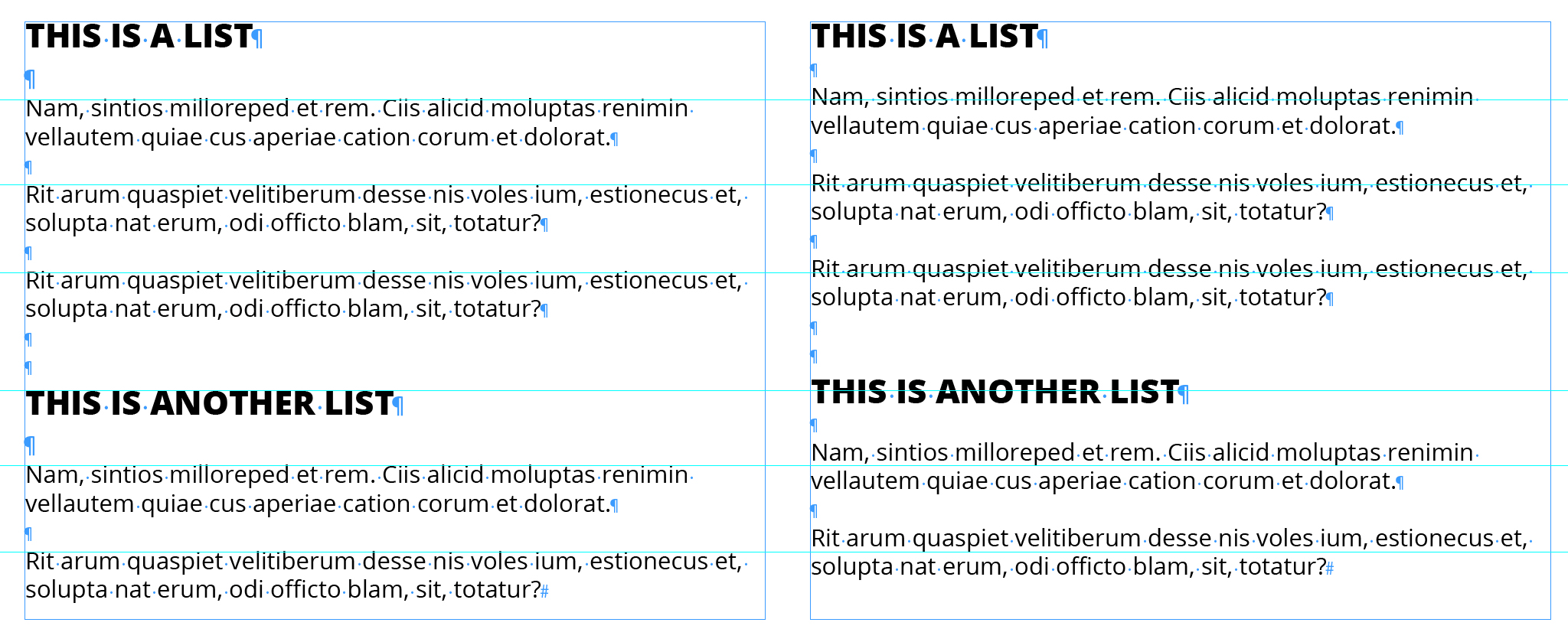
Whereas, in this second image, the distance between the blocks of text matches. To add distance between the paragraphs I used the InDesign Paragraph Style options "Space before" and "Space after".
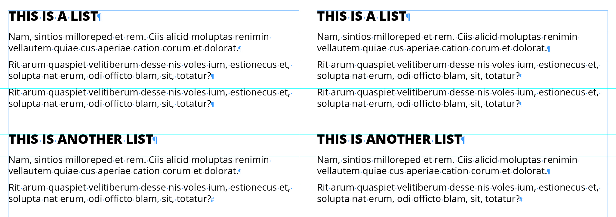
7. Using Different Boxes to Space Out Paragraphs
This mistake may seem impossible to make if you have even just a little experience in InDesign, yet it is a common one. Using different boxes to space out paragraphs is a big unorganized waste of time. You can see an example below.
This is the correct way to add space between paragraphs.
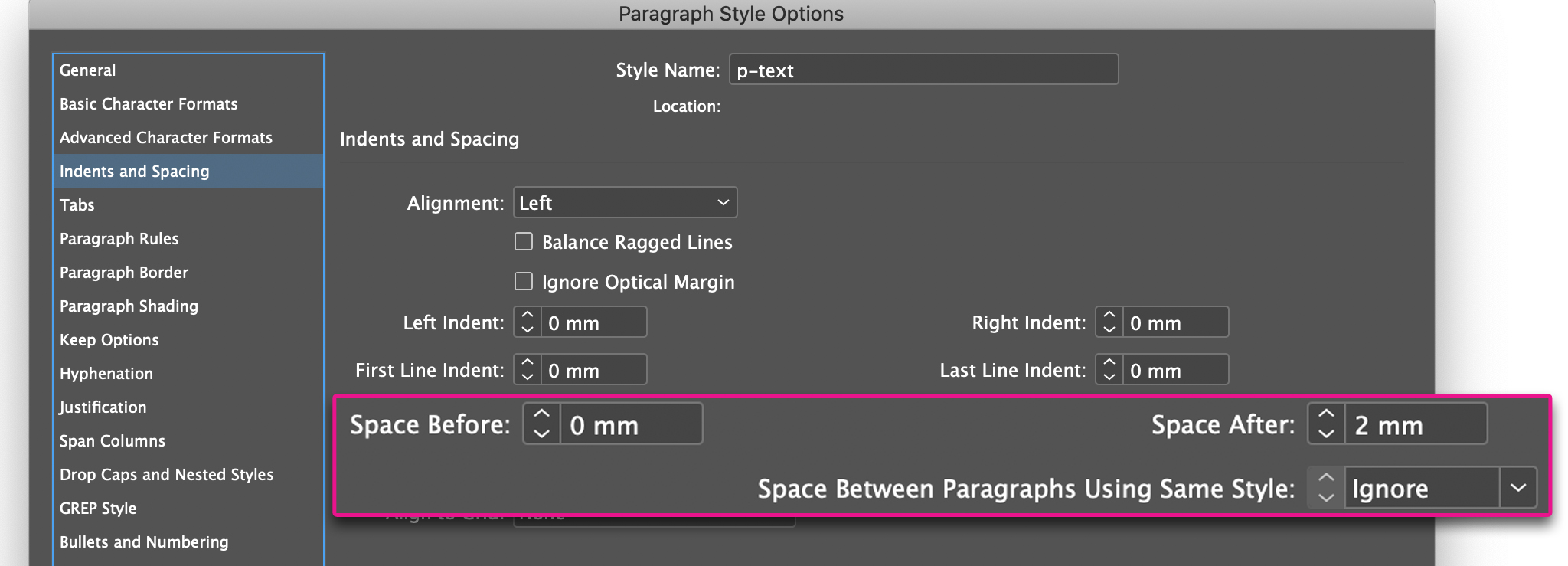
Again, using InDesign Paragraph Style and the Space Before and Space After settings, you can control the distance between titles and text. You can also control the distance between two paragraphs of the same style using the “Space between paragraphs of the same style”.
This way your layout will be precise and stress free.
8. Using Different Boxes with 2 Column Text
Not many know that there are 3 ways to create column text with InDesign; 2 of these let you have your text in either a single column or multiple columns.

That’s why the mistake of using different boxes for this type of layout is so common. A mistake that will cost you time and organization.
Language Management Mistakes
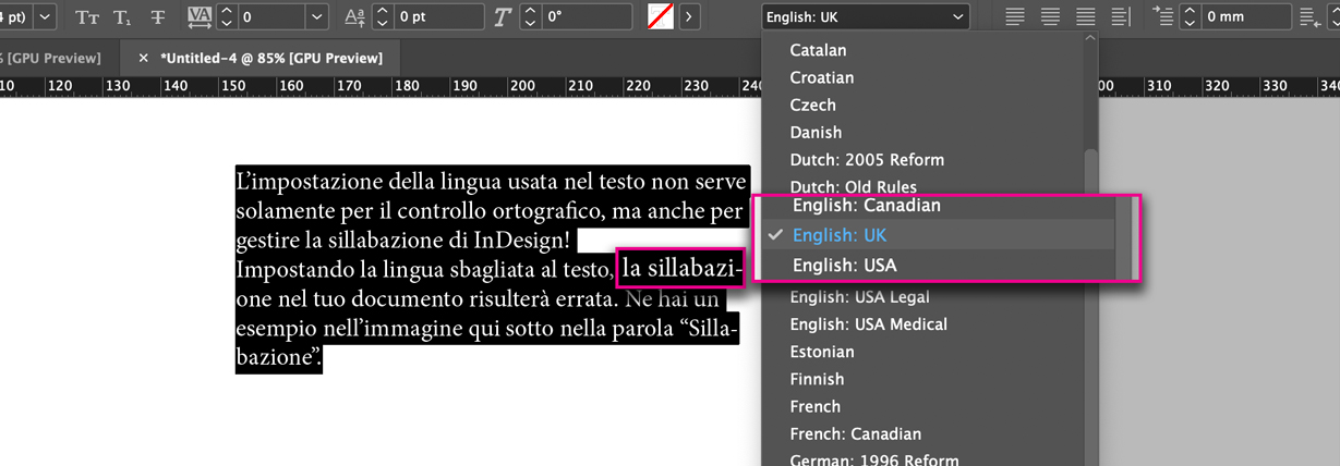
9. Setting the Wrong Text Language
Setting your language isn’t just for spell check, as you can see in the picture below, it’s also necessary for hyphenation.
If you have the wrong language set in your document, the hyphenation will be incorrect. Here is a clear example.
Find out how to make InDesign hyphenation work for you, how to edit it and even how to disable it!
10. Not Using Spell Check
InDesign has a built-in spell check, but not everyone uses it. That’s why, sometimes, you may find mistakes within InDesign documents. Here is how to make the most of the InDesign spell check feature.
Image and Color Mistakes
11. Using the Wrong Black
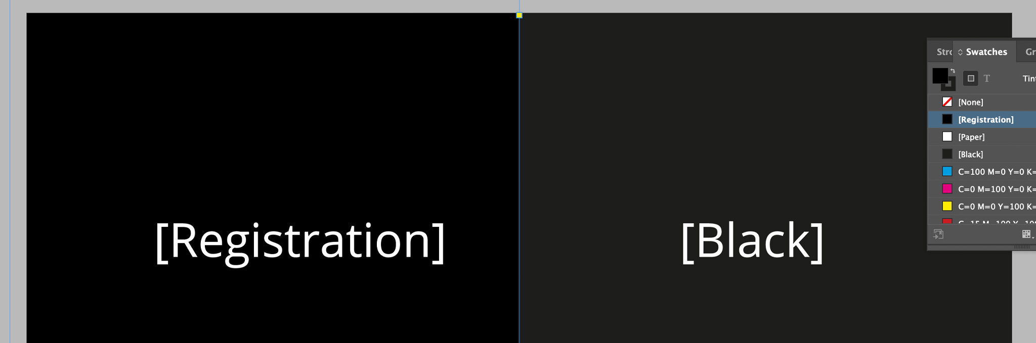
You may see the [Black, K=100%] used to color important parts of documents, or, you may see the [Registration] used.
I suggest you never use the [Registration] color, because, it may create problems in the printing process.
On the other hand, the color [Black, K=100%], if used for large objects, may look faded once it’s been printed.
So, how should you deal with blacks?
Pretty simple, normal text or thin lines should always be in [Black, K=100%]. For other wider elements, large objects or text written in a very big size, you should create a rich black.
12. Not Checking the Colors Before Printing
The colors you see in pictures below are exactly the same.
How they appear in the InDesign document.
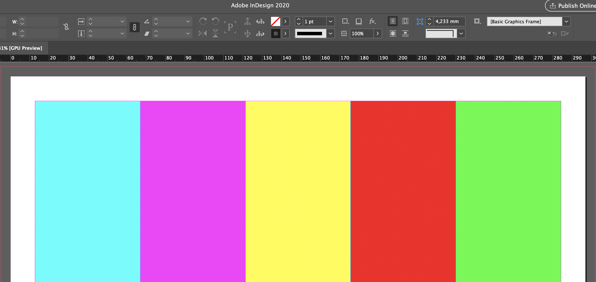
How they will result after print.
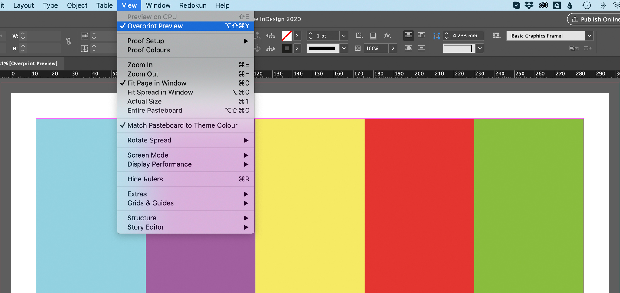
The function “Overprint Preview” tries to mimic what the print result will be. See the difference? It’s always best to check your colors!
13. Managing Text INSIDE the Images
Look at the tags in both of these images.
Managing the text within an image doesn’t let you control how that text will be displayed in InDesign. The text inside the image on the top left is smaller than the text in the image on the bottom left.
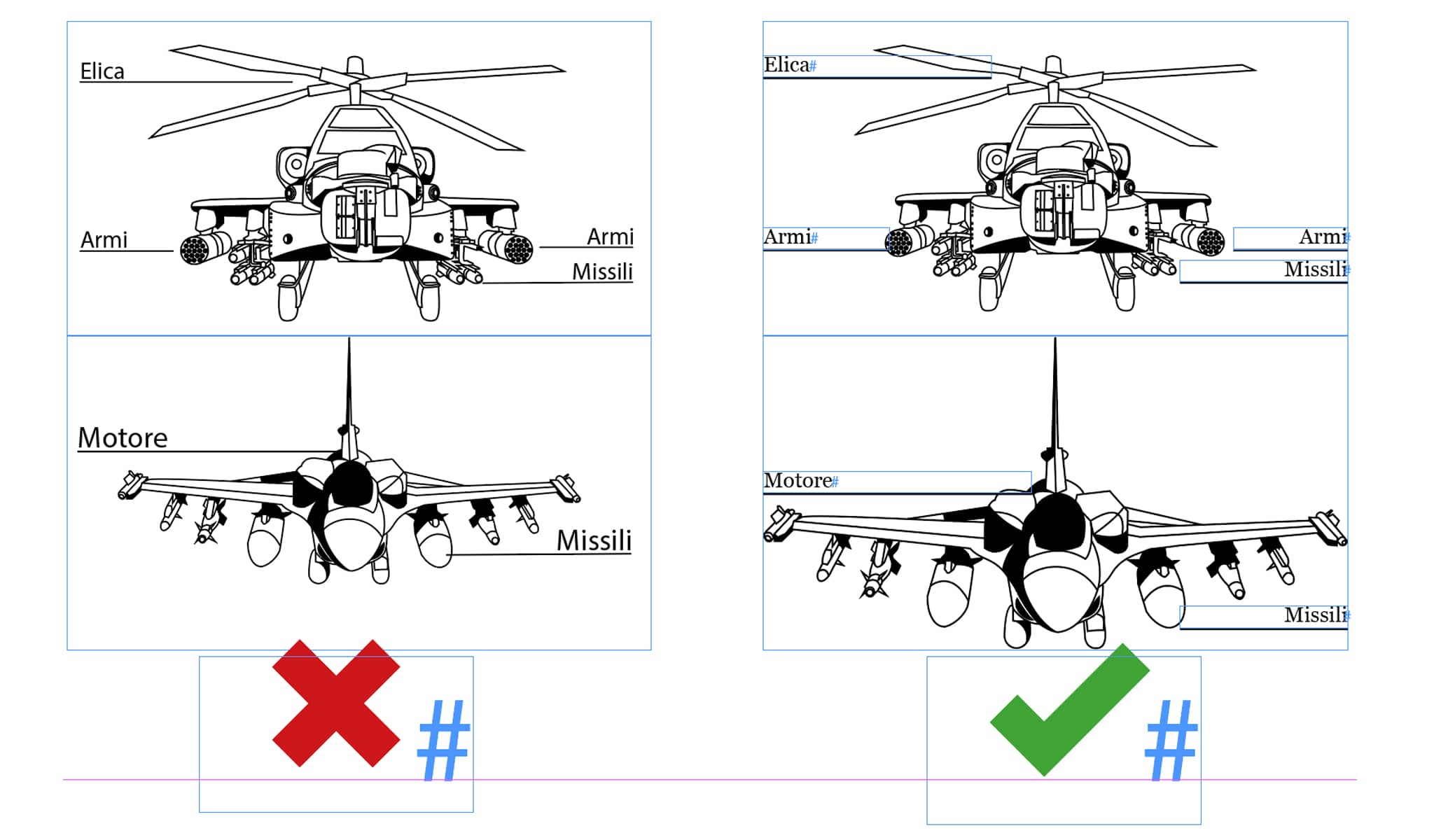
Learn how to insert images in InDesign and deal correctly with their text.
14. Incorporating Images
Copying and pasting images from other programs might be risky; usually:
- the file becomes heavier and harder to manage.
- the file risks becoming corrupt, which means it won’t open.
- Modifying images becomes harder.
Some InDesign experts define a few extreme cases in which you should incorporate images. I wholeheartedly disagree. Every time I had trouble opening an InDesign file it was due to a corrupt image.
15. Not Anchoring Images
Have you ever experienced a similar situation?
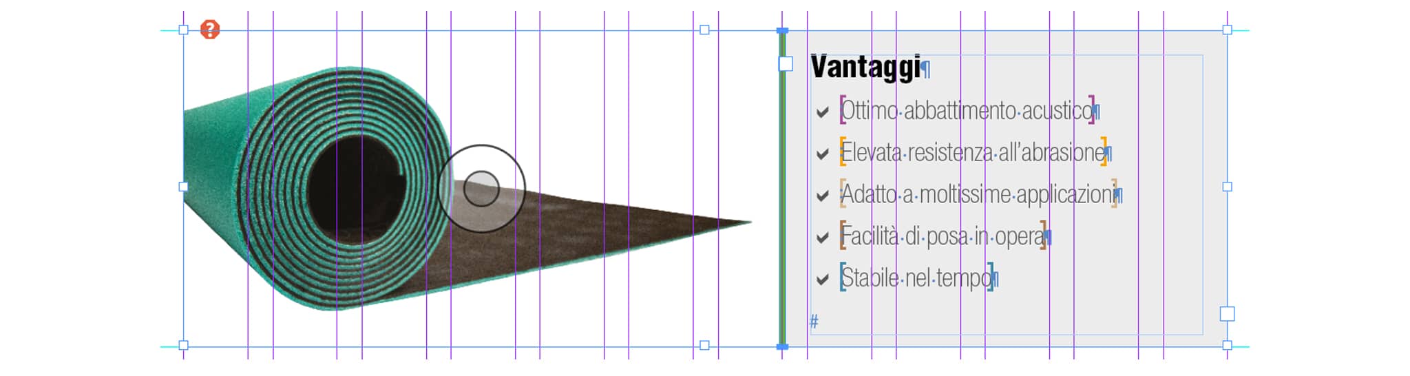
The image in case has to stay next to this text box.
In this example, though, the two are not tied together, meaning that if you move one, the other stays where it is.
To tie together the two elements you need to use an “anchor”.
You can learn how to anchor an object in this other post.
Function Mistakes
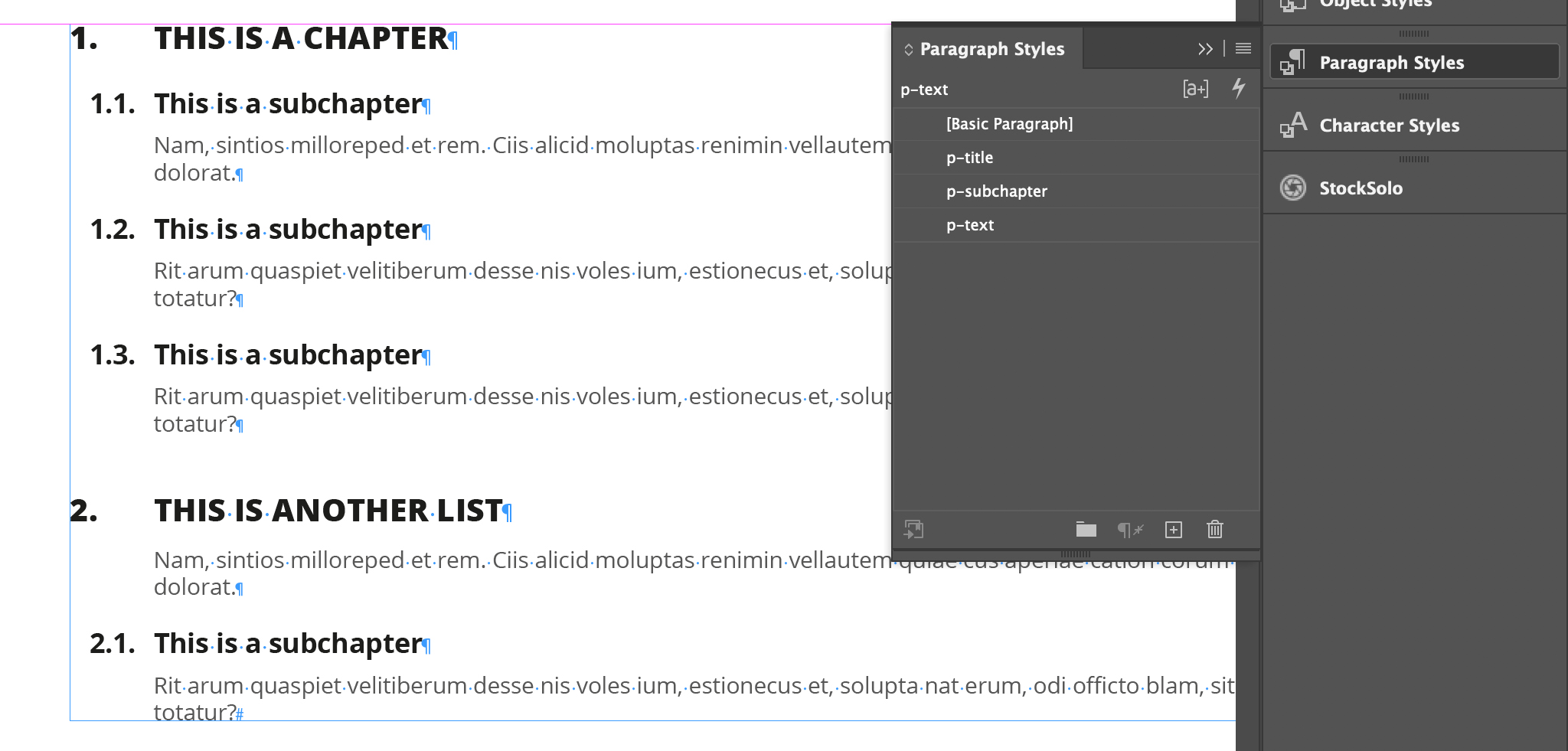
16. Number Chapters Manually
The chapters you see below have been numbered using NUMBERED LISTS, not manually.
If you set your Paragraph Style this way:
- You won’t have to manually update numbers
- You can move, delete, add chapters, subchapters, etc. anywhere, without worrying about “breaking” the numbering.
17. Not Using the Automatic Table of Contents
InDesign can create an automatic table of contents. This function has two main advantages:
- You don’t have to manually update entries or page numbers.
- It creates bookmarks and links to the table itself. That means that in PDF you will find the bookmarks and you will be able to click on the table of contents (when opened on a computer).
Creating a table of contents in InDesign cab be a little bit tricky. Luckily, we already have a guide for everything related to the InDesign table of contents.
18. Not Using Baselines
Baselines help you keep text aligned throughout different boxes or columns in your layout.
Look at the difference between these two examples. The text on the left doesn’t respect baselines, the one on the right, does.
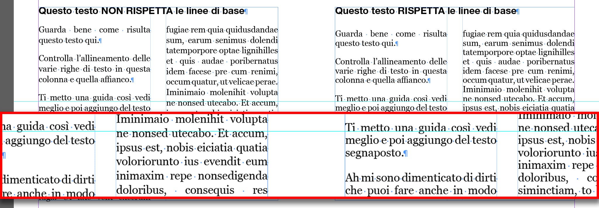
The box on the right, where the text is aligned throughout the columns, looks much more organized and easy to read.
Unfortunately, I haven’t wrote anything about this feature, and I don't think I'll plan on writing about it because the topic is too wide and complicated for a single post.
However, I can highly recommend Nigel French’s course "Designing with Grids in InDesign” where you’ll learn how to use Baselines, but also how to fit them into a more organised system (a grid system).
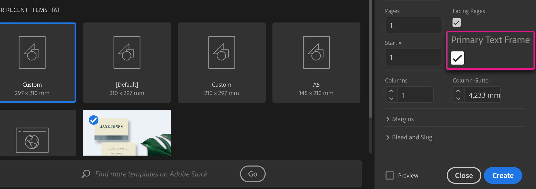
19. Not Using the "Primary Text Frame" in Documents with a lot of Text (Like Books)
By using the “Primary Text Frame” feature you can enter a text of any length in InDesign and it will automatically place it, adding however many pages are necessary to contain it.
If you’re setting up a book or a manual, this feature will save you a lot of time!
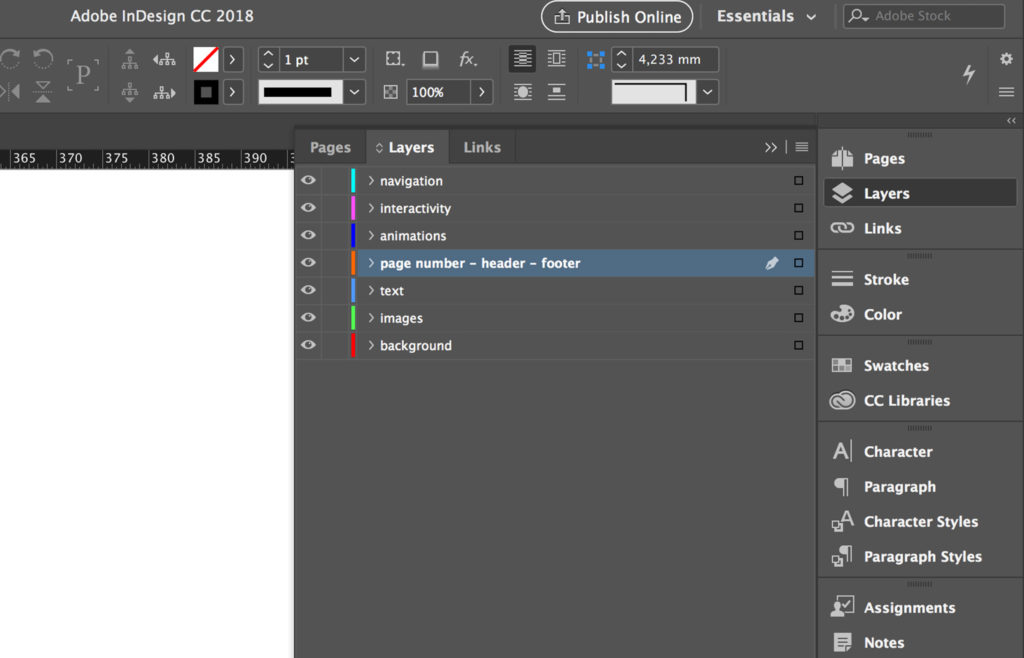
20. Putting Layers in the Wrong Order
What you see in this image is the order you should have your layers in.
- Navigation: You will have this layer in digital documents only
- Interactivity: You will have this layer in digital documents only
- Animation: you will have this layer in digital documents only
- Page number - Header - Footer
- Text
- Images
- Background
These are just a few ways in which you can improve your InDesign experience. With a software like this you never stop learning new skills and improving on the ones you already have. There are so many options out there: tutorials, courses, and good old fashioned trial and error. The important thing is to try new things. Whether it be trying out a new Template, learning about advanced features like Data Merge, searching for a useful script, always try new things!
Because here is a bonus mistake for you:
Not Thinking Outside the Box!
There are so many possibilities in InDesign to help you:
- have a more organized layout.
- save time.
Learning different page features; discovering new scripts; knowing how to use Styles; all this and more will help you better navigate InDesign.
So what are you waiting for? Go try out all this new-found knowledge!
Everybody makes mistakes, and that’s especially true for InDesign!


